Lustucru
A bit of history
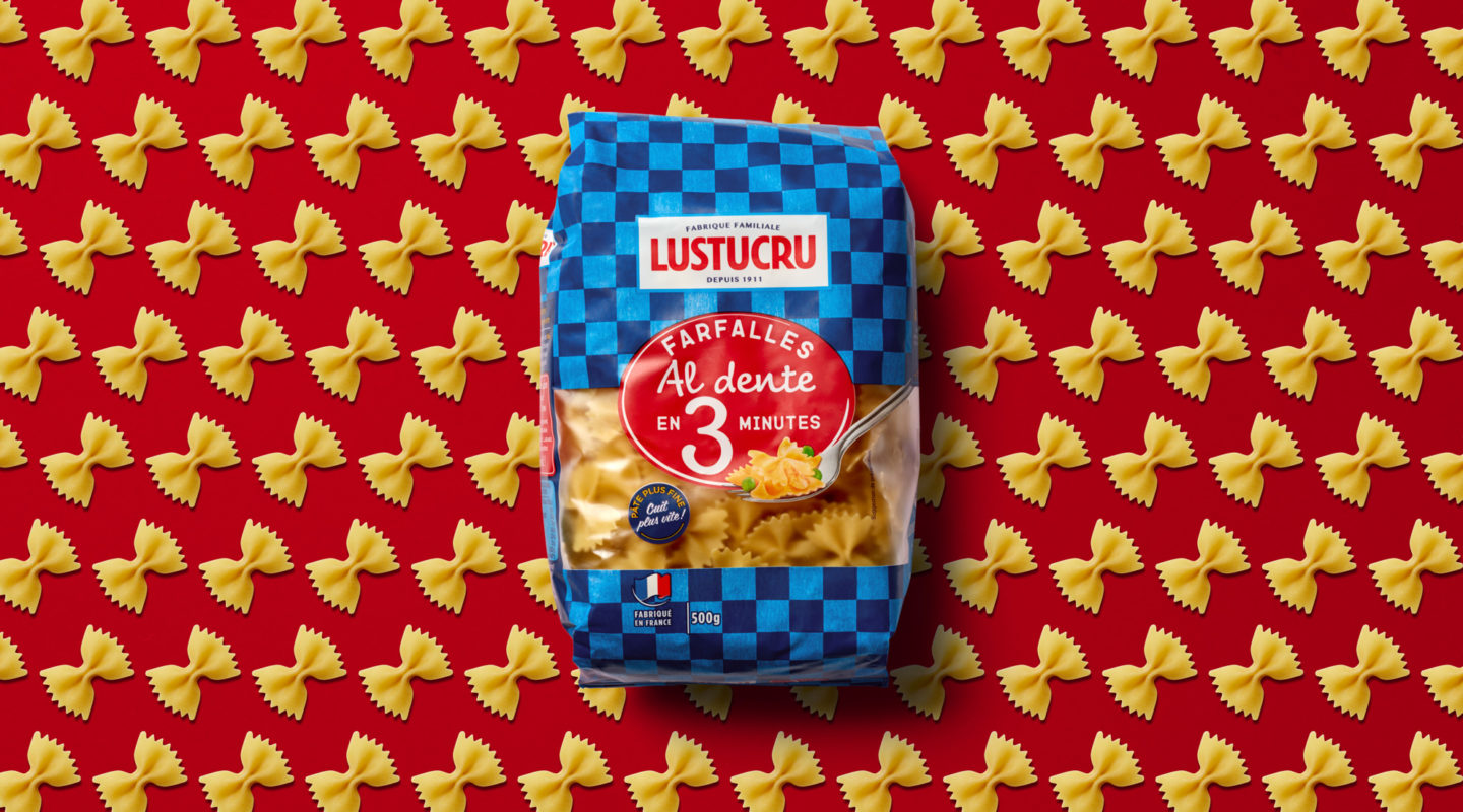
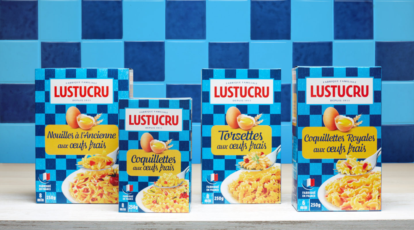
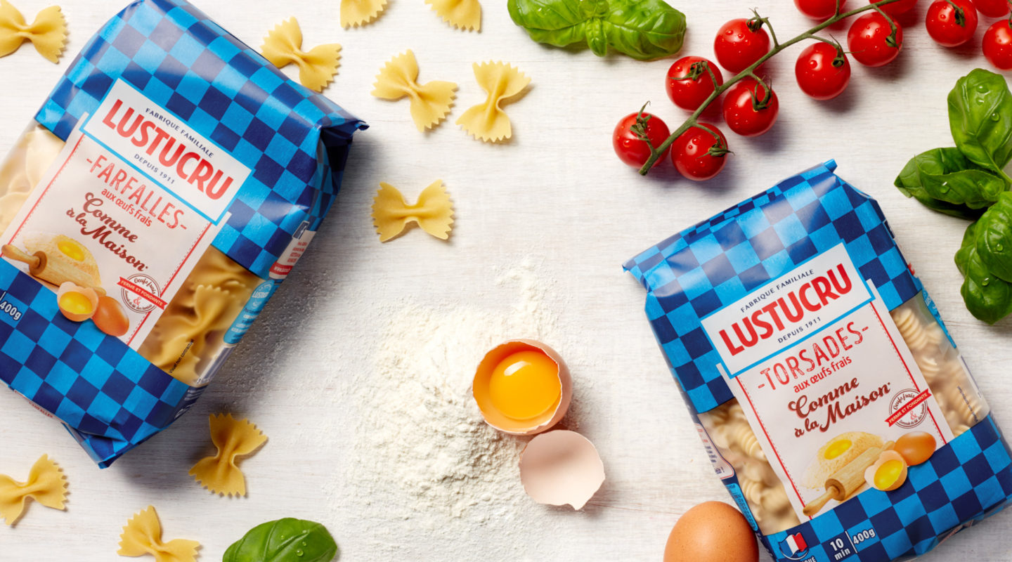
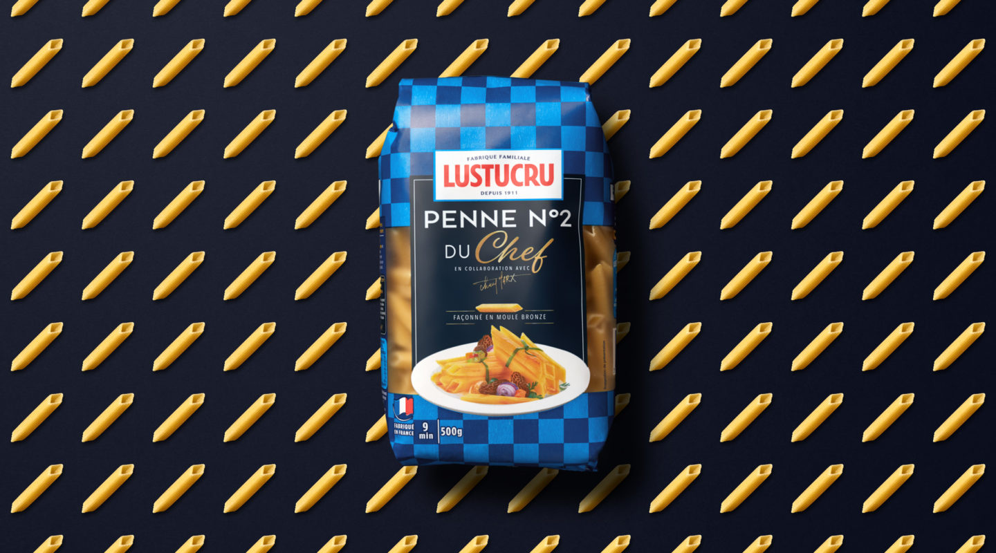
In 1911 the family pasta factory became a legend. The famous illustrator Synave won an advertising poster contest with his design showing a box of pasta painted with a light and dark blue checkerboard. The name Lustucru was chosen the same day.
The checkerboard is more than just a visual feature making the brand immediately recognisable: it recalls the dish towel found in every French kitchen and quickly became an icon.
Over 100 years later
Lustucru, still part of everyday life in France, asked Dragon Rouge to redesign its identity. The agency relied on its identity codes to emphasize the emblematic brand’s authenticity. The brand’s legacy and know-how are now at the centre of its message.
The new logo is a contemporary interpretation of the sign on the front of the first factory. It is more minimalist and elegant, asserting the status of a family factory that has existed since 1911. The blue checkerboard became more discrete as time went by. Today it features prominently again on all the product packaging. The agency showcased its iconic and transversal character while creating a true identity for each line of a generous, authentic brand.