Singlespot
Revenge of the retailers
Translating the power of data
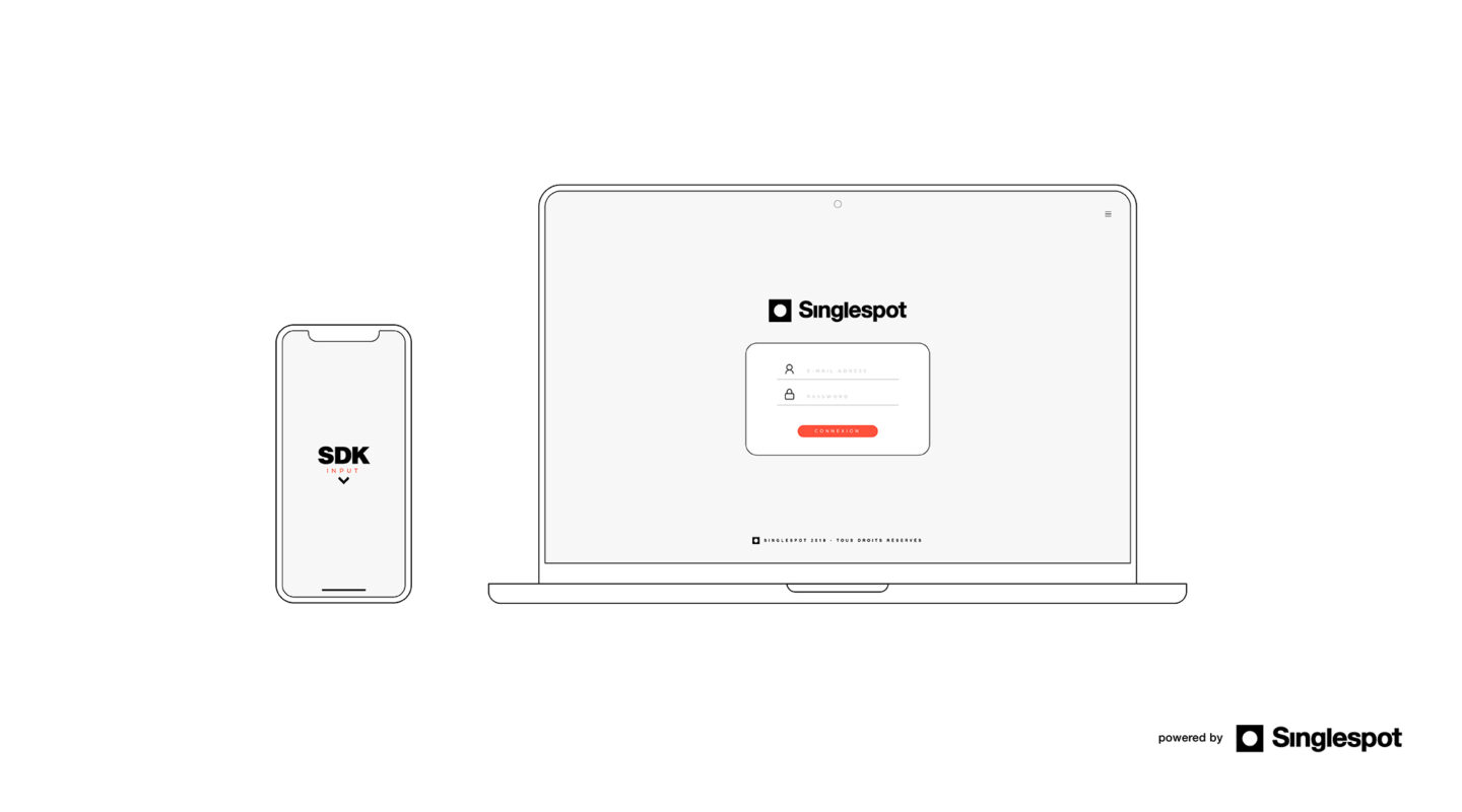
Singlespot, a French start-up and data shopper platform that collects and qualifies geolocation data to increase the performance of brick-and-mortar points of sale, called on us to rethink its positioning and visual identity prior to its European launch.
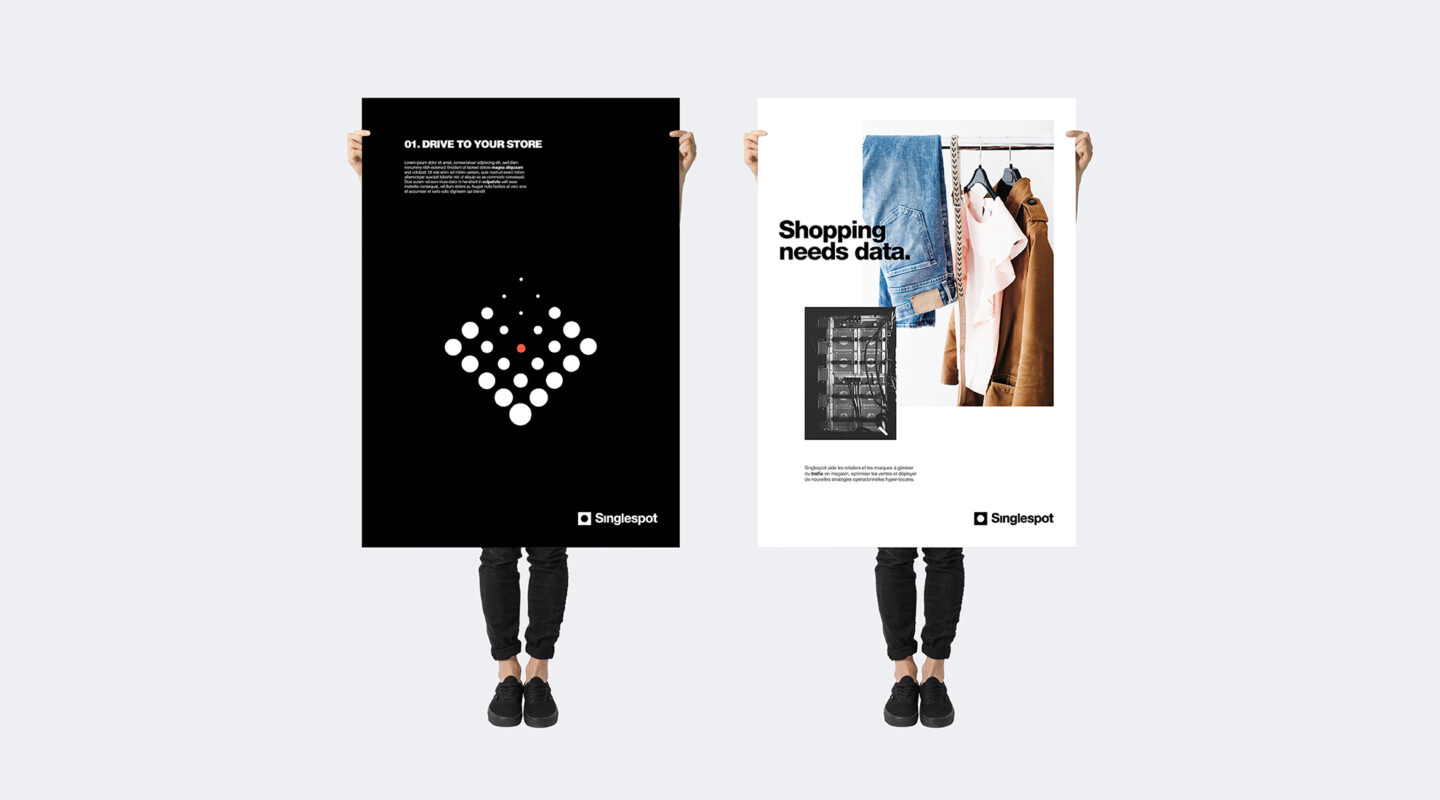
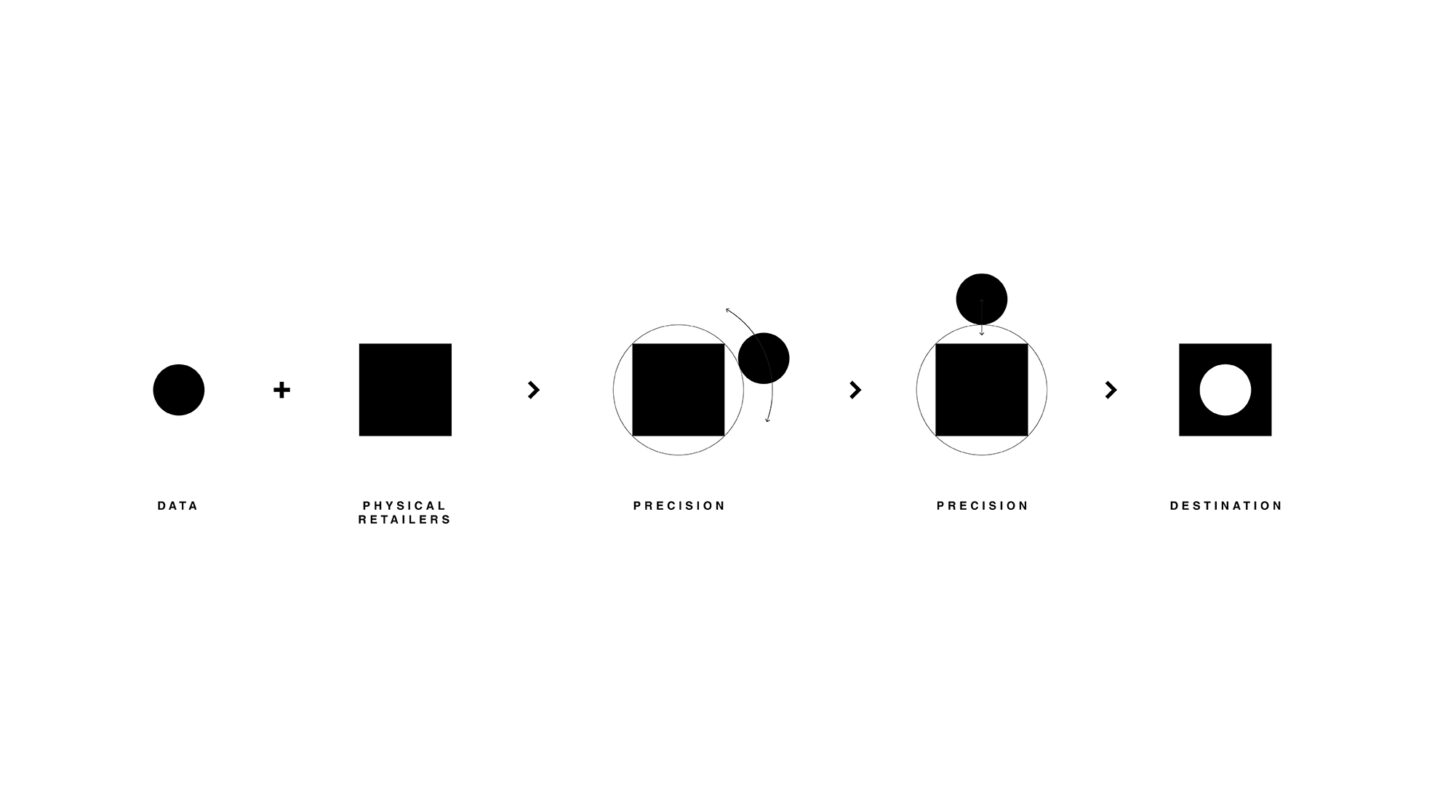
Visually, the agency wanted to translate all the power of its algorithms, the finesse of the results and key role of people into an ultra-minimalist and neutral design: a circle within a square, like a retailer’s perfectly geolocated data.


The power of simplicity
A square, a circle, black and white… the territory deliberately reflects the binary nature of data and above all, the sobriety and pragmatism around which Singlespot’s teams are framed.
A touch of orange also punctuates this ensemble to bring the idea of movement, but also the energy behind the teams’ commitment to help brick-and-mortar retailers.
Finally, from typography to photography, Singlespot seeks to be direct, readable and unfiltered to take on its positioning in all transparency and to establish a young leadership without frills.