Four steps to help brands win with colour
Digging into how brands can use colour more effectively
Research at 3M Corporation concluded our eyes process colour and shape 60,000 times faster than text. This means that people are more likely to recognise and identify a brand by its colours and shape/symbols 60,000 times faster than by reading its name.
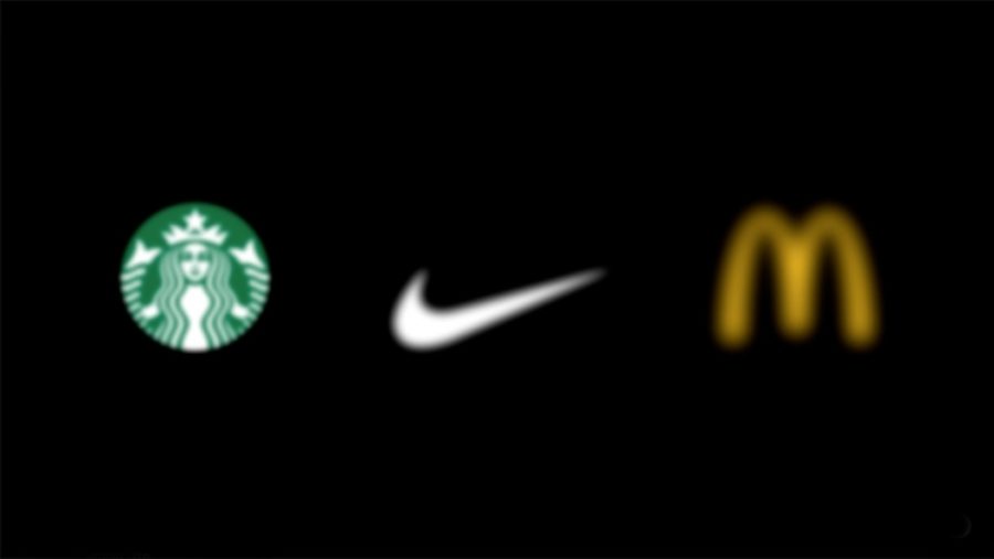
85% of consumers said that colour is one of the main reasons why they bought a particular brand (FastCo), and 90% said that they judged a product within the first few seconds based on the colour of the packaging (Sciencedaily).
Carl Gustav Jung said “Colours are the mother tongue of the subconscious”. And he was right, colour talks directly to our most subconscious emotions. But did you know that colour isn’t really real? What is actually happening is that our brain receives light waves and signals and then the part of the brain that receives these waves connects our endocrines with our nervous system. Colour and emotion appear within close proximity to each other in our brains and this is why colour has such a profound effect on our behaviour and mood and why it is important in branding, packaging, web and product design.
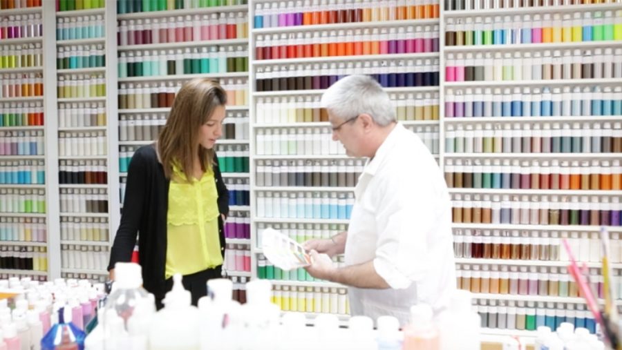
At Dragon Rouge, we make sure we give colour the care it deserves. Our team of creatives and our dedicated colour expert have been researching and developing colours for over 30 years. From creating colour palettes and working on packaging briefs to determining colour tones for product ranges and even working with interior designers to brand spaces, the team enjoy working on a diverse range of projects for clients. No matter what the brief is, every creation combines the analysis of our strategists, trends forecasters, the sensibility of our creatives and the craftsmanship of our colourists to make sure the result is as strong as it can be.
For most brands, using colour effectively is about two areas. The first is differentiation – making a brand noticeable from others, as fast as possible. And the second is ease – helping consumers navigate through product ranges and simplifying choices. Colour cannot simply be about making something beautiful; it has to be about making our lives easier and driving differentiation.
In a visually noisy world, our brains are in contact with thousands of visual, graphic and colour codes every day, so a brand’s carefully chosen combinations are rarely unique. To add to the pressure, brands are needing to create identities, products and packaging that work in both the digital space and on shelf for effective stacking and shipping. So how do we overcome challenges like this with colour?
We’ve identified four key steps:
1. Remain simple and accessible
Everyone perceives colour differently. Colours have different meanings in different cultures; the way by which men and women perceive colour varies; and believe it or not, younger people will see colours differently to older people because our eye sight changes with age.
It is essential to have a good understanding of the wider context in order to make sure your colour choice is accessible and inclusive.
2. Stay fresh
The visual expressions that emerge from cultural trends are continuously evolving. You need to have a point of view on what’s yet to come and believe in proposing a new vision.
Category colours are also important. You need to evolve within the category norms by overlaying trends that will add relevance and currency to your brand.
By keeping a different perspective on things, thinking differently, borrowing from different categories, thinking of what your consumer expects and might not expect will help your brand stay fresh and dynamic.
3. Make sense
You need to make sure your colour choices are completely aligned with your brand values and personality. Your colours need to be coherent with the rest of your story.
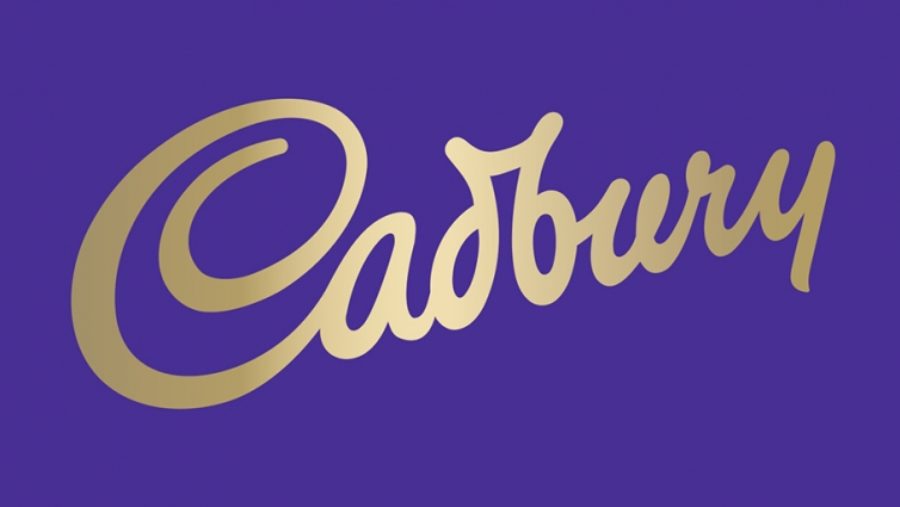
Different colours have different psychological properties. Take purple for instance, it’s about quality, it’s magical, mysterious and imaginative, it evokes luxury but is also about spiritual fulfilment. And now think of Cadbury and what the brand stands for. Coincidence? No.
As marketeers, strategists and designers, it is our job to make sure we find ways to visually differentiate ourselves from others. And sometimes, rather than following the norm, what we want and what we look for is to provoke graphic disruption to stand out. But we need to be careful. The line between differentiation and losing your consumers is actually quite thin, and if we aren’t able to tell a story with colour it becomes superficial. Make sure you keep aligned with your brand strategy.
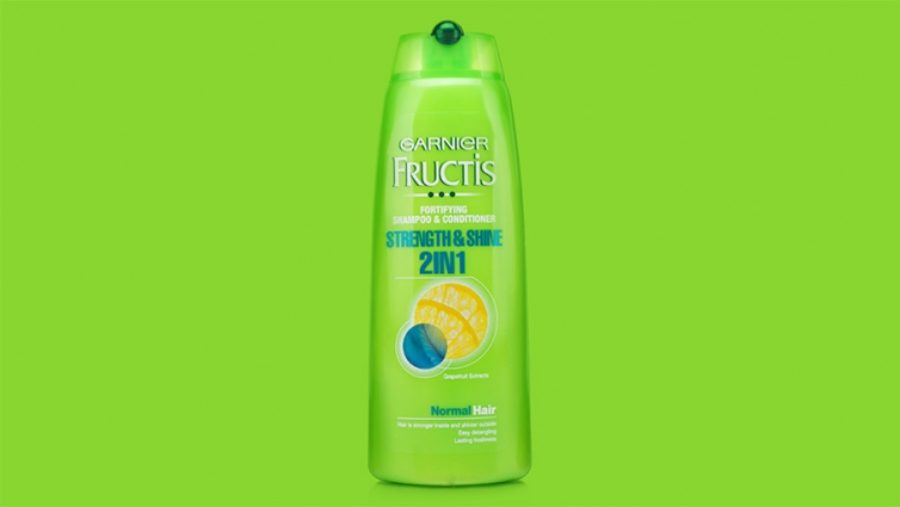
Fructis was the first shampoo made with active fruits. And at a time when hair care and cosmetics were white, pure and clean, they came in with lime green. It was ballsy – people could have read the lime green as acidic. But it was actually one of L’Oreal’s best launches in 1996, and after 6 months Fructics became one of the best sellers in the category. They broke the rules to speak to an active, sporty, younger consumer in an upbeat and energetic tone.

Before Google came in with their multi-coloured logo, tech was blue – because blue is about intelligence, communication, trust, efficiency, duty and logic. Suddenly Google used red, yellow, blue and green in an almost, childish manner. They broke the rules to show the simple functionality of their products – so simple that even a child could use them.
4. Facilitate creativity
The future promises a colour revolution for the digital world. We will use technology and innovative techniques like integrating fibre optic powders into colour to add another dimension. But in order to do this, teams of people with very different skills will have to work together. So don’t limit yourselves to think whether that can or can’t be done. Think of different ways to approach colour, mix teams up, turn colour upside down and make sure you facilitate the most creative mix-ups in order to take your brand a step further.
And if you remain simple and accessible, if you stay fresh, if you make sense, and if you facilitate creativity, you will win with colour.