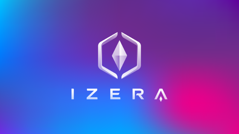
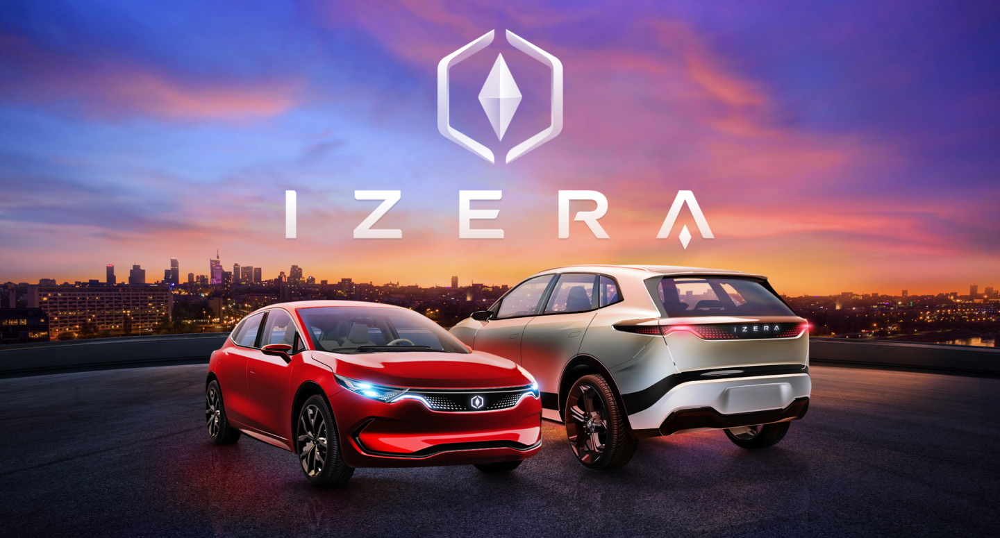
Izera
THE CHALLENGE
ElectroMobility Poland SA has embarked on a project that aims to deliver a long awaited Polish car brand – modern, designed for the contemporary world and able to compete with other top car brands. To that end, the best specialists from Poland and around the world were asked to design and build prototypes of electric cars and the technological infrastructure. Dragon Rouge was tasked with creating a brand for the Izera car, from strategy to visual identity and slogan.
A brand inspired by nature
The name Izera comes from the Izerskie Mountains, a pristine and beautiful area located within the borders of Poland and Czechia.
Gazing at the sky reflects the desire to discover the world beyond one’s immediate reach and the determination to follow one’s dreams. We have been fascinated by the multitude of colors visible in the sky changing with the time of day and the weather.
This has been our inspiration – gradient colors and blending of one color into another are a defining feature of Izera’s visual identity. The style and construction of the car are also inspired by nature.
Play

A brand inspired by technology
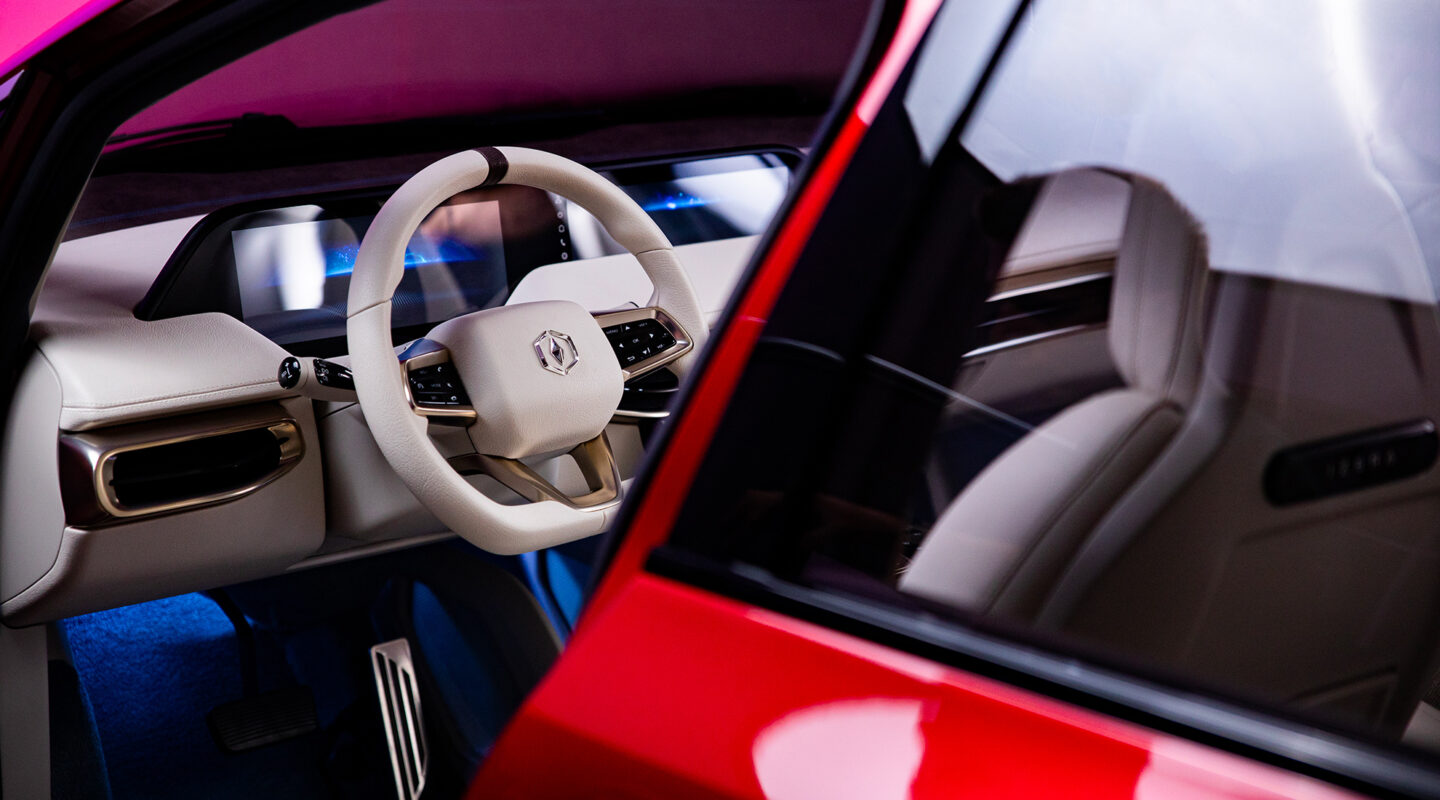
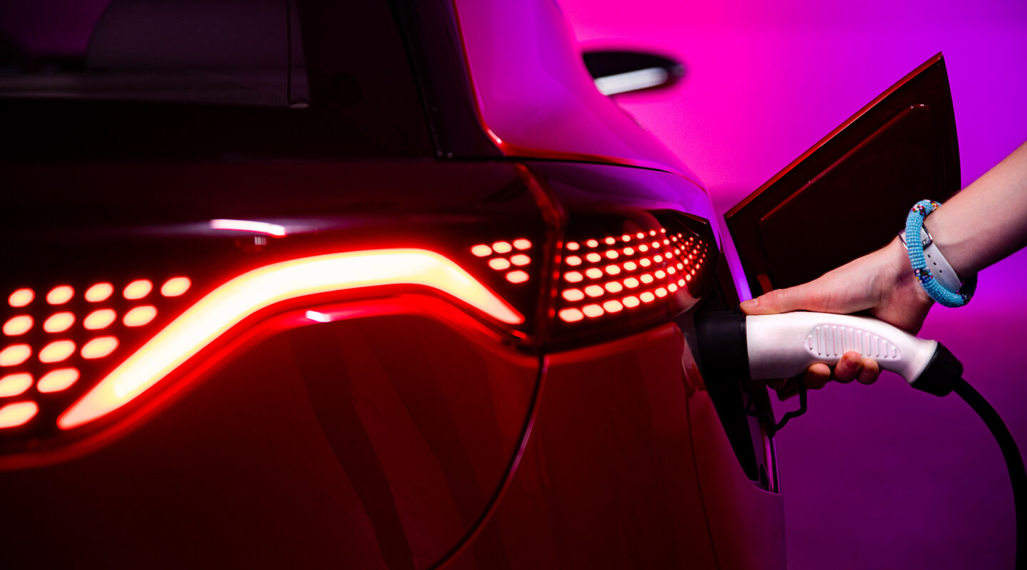
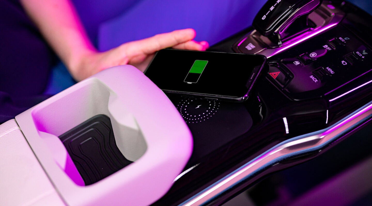
Izera has been built based on cutting edge technology because in the modern, fast-paced world we need innovation to bring us solutions. From touch screens on the dashboard, to the possibility of installing three seats in the back or using the fast-charging option, this product characterized by modern, uncompromising style requires contemporary digital identity.
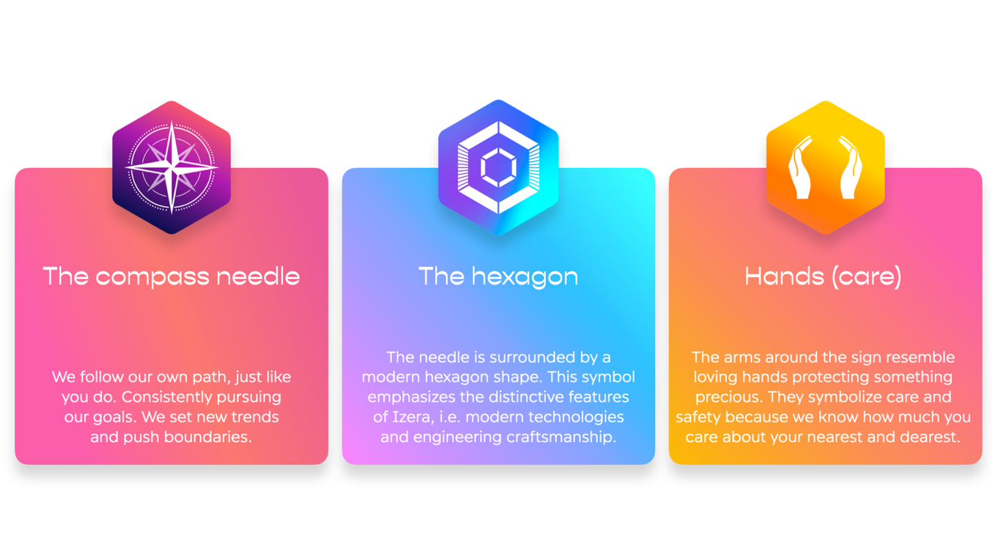
This is why we built the brand based on the hexagonal shape, semi-transparent objects, color gradients and elements set in motion. We wanted to create an effect of movement. Such treatment and features are appropriate for the digital medium and reflect the progressive character of the brand
A brand inspired by people
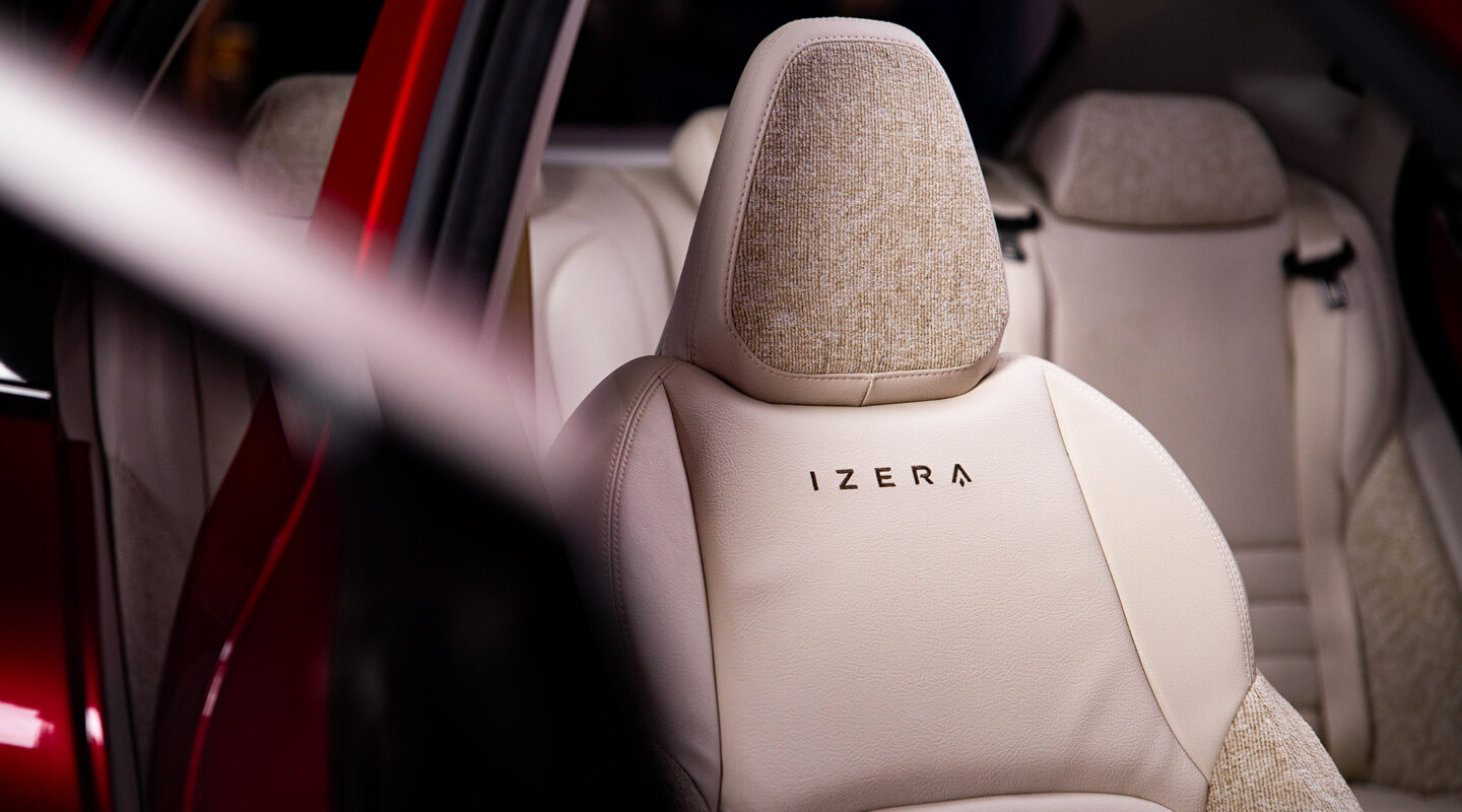
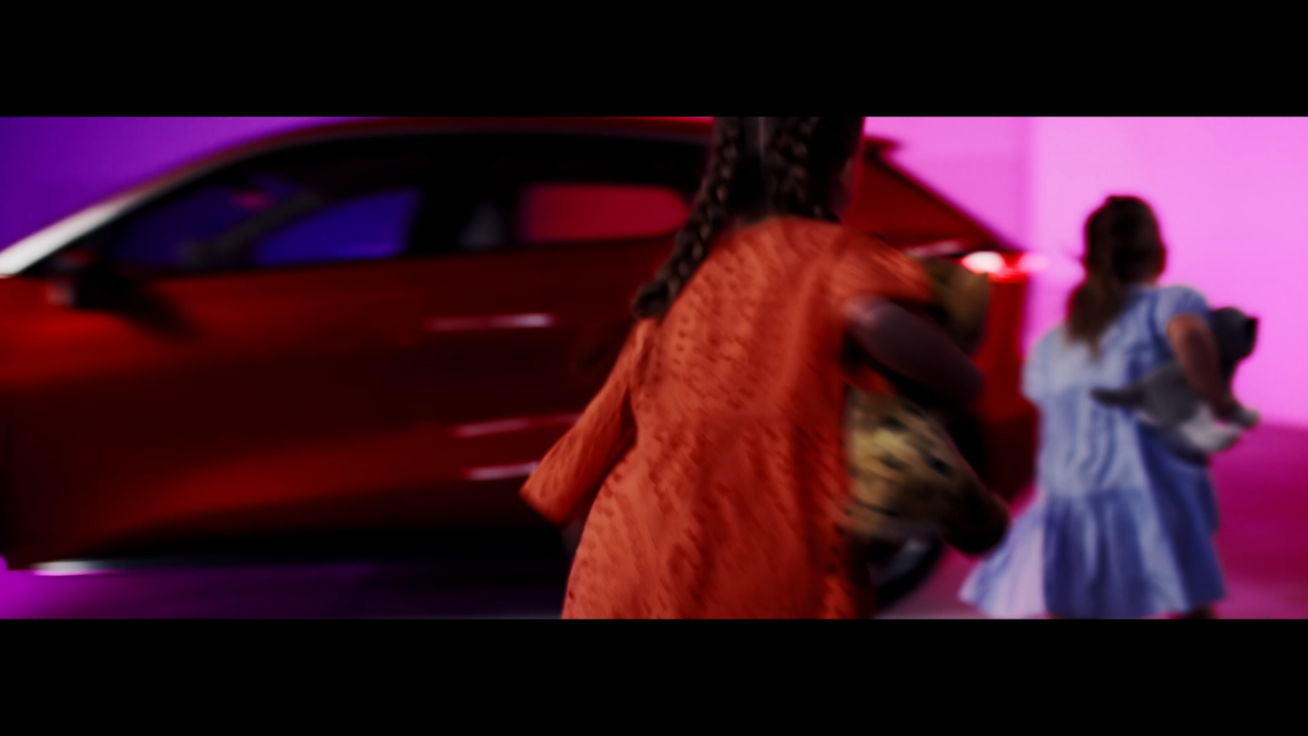
Izera’s two models are a family SUV and an urban hatchback. They are functional and innovative, designed to provide first-class comfort to the driver and passengers. The identity exudes optimism and positive energy.
Bold, vivid colors, organic font and softly rounded edges of all graphical elements draw attention to the many assets of the cars, the spacious interiors suitable for a family, the attractive and dynamic design and the versatility of use for the day-to-day in the city or for those occasional escapes to the countryside.
Play
The direction for the new brand
Through consumer research, analysis of trends and visual codes and also by looking at the way car brands were communicating for both, combustion and electric cars, both in Poland and abroad, we arrived at several possible areas of exploration in defining the new brand. These activities also made it possible for us to specify the target group profiles.
After consultations with the client, we set on a course that involved highlighting technological features - crucial when launching a new car - while maintaining an image of a humanistic brand with references to nature - which are important aspects for our target groups.
We also wanted the identification to reflect a boldness and courage necessary to rise to the challenge, which is embedded in the brand's DNA