Nest Bank
Spread your wings
Big names in the banking industry leave no room to new firms to stand out. However, newcomers can differentiate themselves with a little bit of subtle persuasion.
CONSERVATISM IN A MODERN OPENING
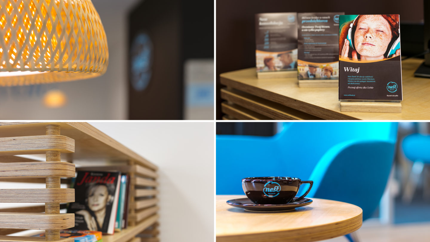
Nest Bank is a bank dedicated to family-oriented people. Our task was to create a brand trustworthy enough to compete in the finance world, and simple enough to belong to the modern world of Mr. Smith. We had to rethink the whole strategy of the brand, its design and the customer experience to deploy in the bank’s branches. Nest bank built its image on the values symbolized by Nest – safety and protection.

Play
BANK WHICH IS OTHER THAN THE OTHERS
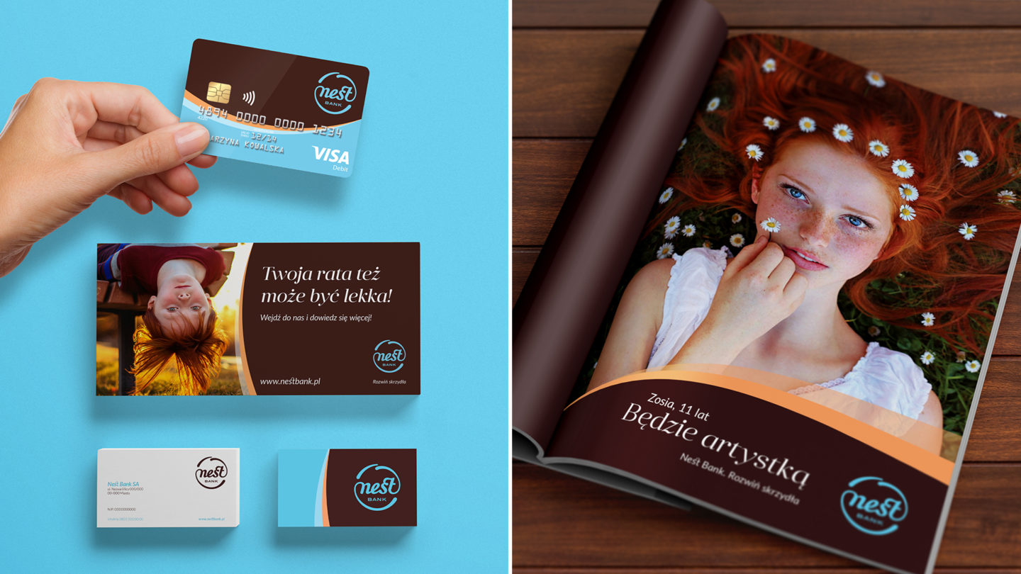
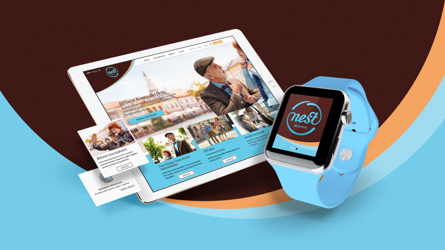
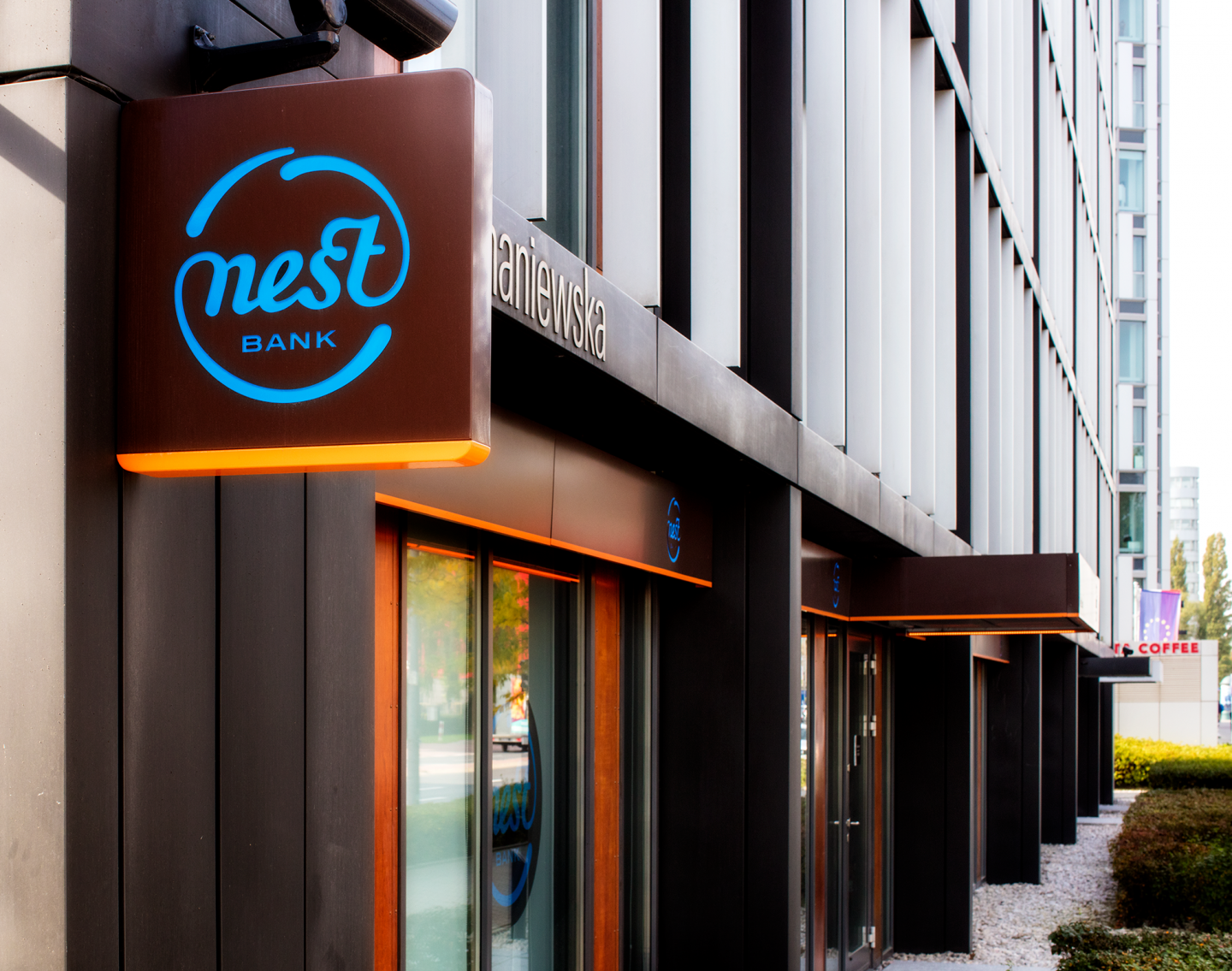
In order to distinguish Nest Bank from other banks we needed to come up with a unique solution. That’s why we abandoned the safe territory of the color code. We chose brown for peace and harmony and blue symbolizing the order to become the colors of our bank.
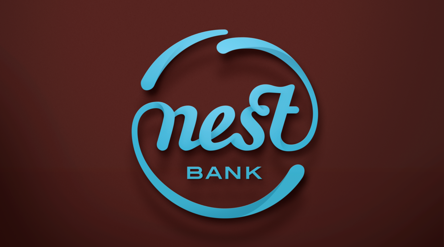
The shape of the logotype refers to the shape of a nest and its typography looks like a handwritten note, symbolizing the guarantee of a word being kept.
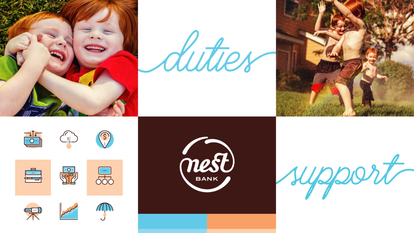
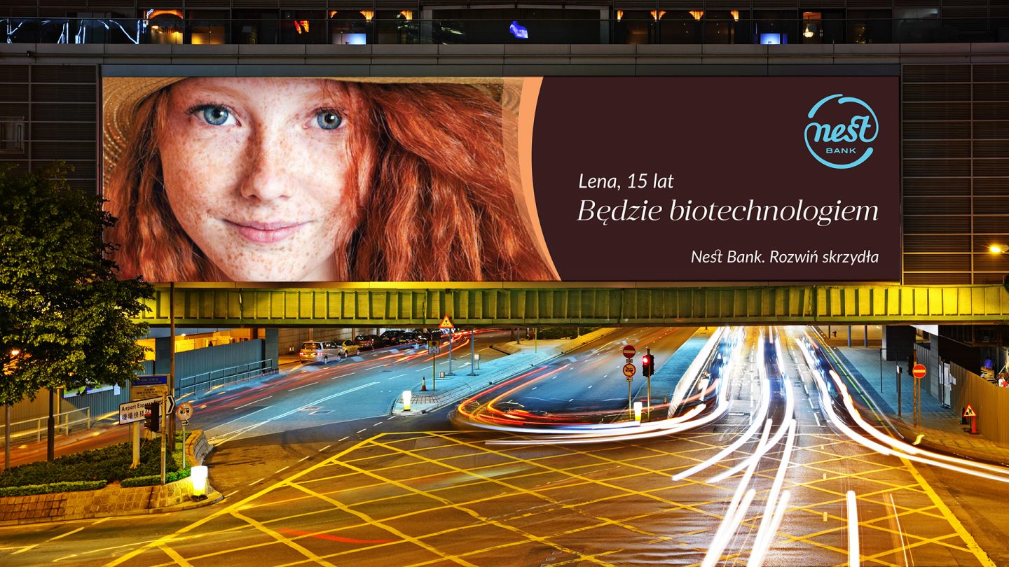
The brand is positioned to build upon emotions associated with family and children. The brand’s claim: “Spread your wings” represents its core values and the images of bright-eyed children adds recognition. These visual assets communicate the message that Nest Bank will help give your children a good start when their time comes to fly away from the nest.
Play
Play
Following the launch, Nest Bank quickly attracted attention in the market thanks to its highly expressive and emotional image. In just 4 months its aided brand awareness has grown to 41% and the brand has been clearly regarded as credible (51%), dedicated to families (55%), honest (51%) and transparent (55%) becoming a true challenger in the market.
Play