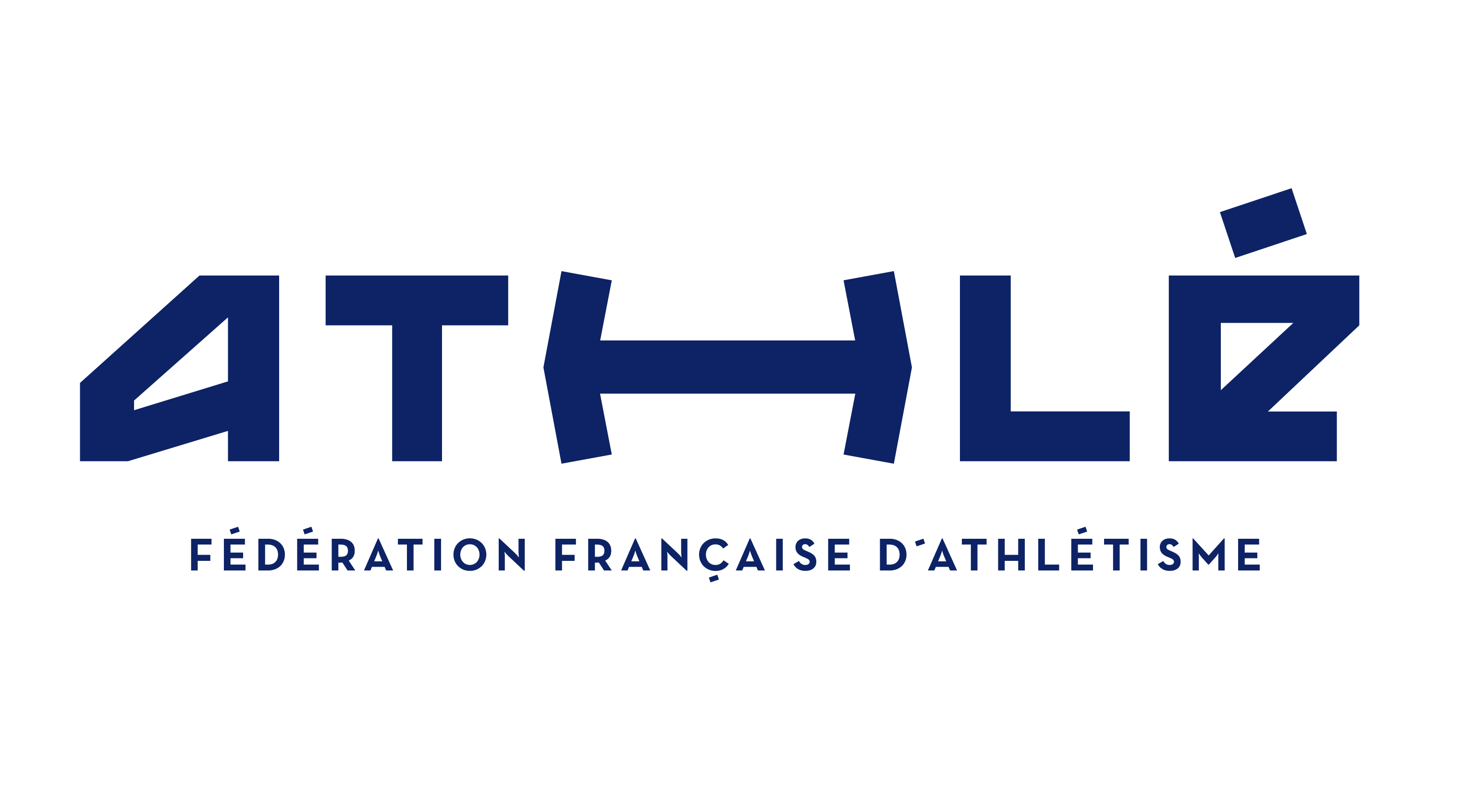
Athlé
Better Unity
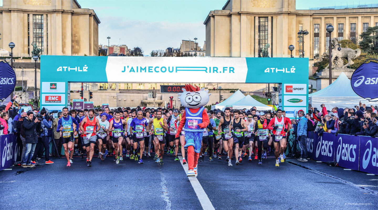
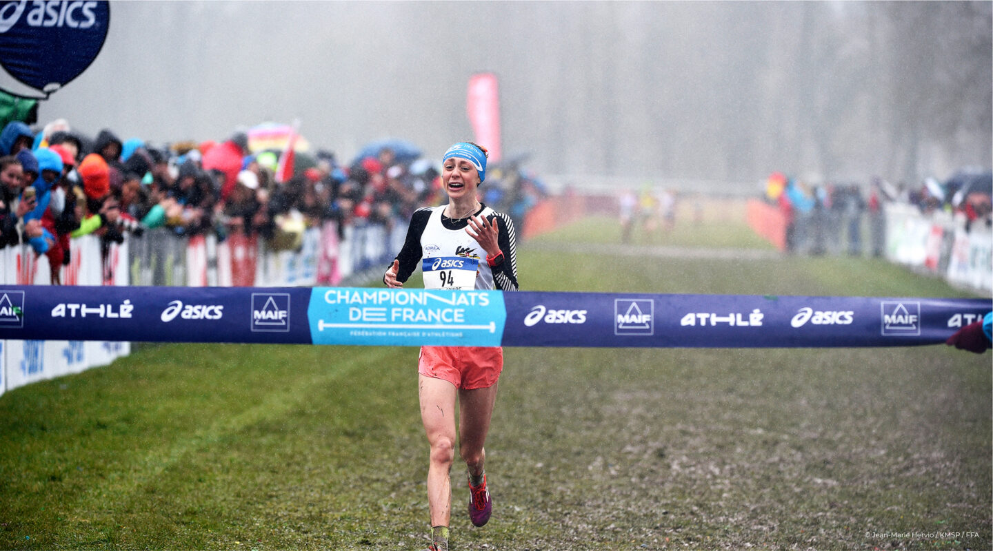
Athlé has sparked a new dynamic for the name of the Fédération Française d’Athlétisme, (F.F.A.) France’s Federation of Athletics. More active and unifying, its interdisciplinary message is reinforced: “From the track to the street, through its Athlé clubs, the federation is here to help you progress in all sports. The brand-new graphic identity makes Athlé more visible and unites its existing and potential members around a shared state of mind. More lively, modern, and communicative, Athlé brings the federation into a new brand dimension.
Play
Meaning and style
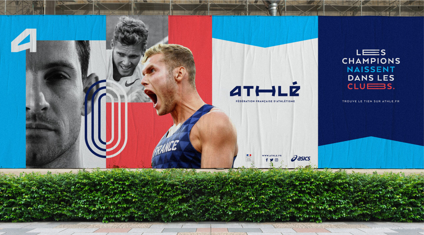
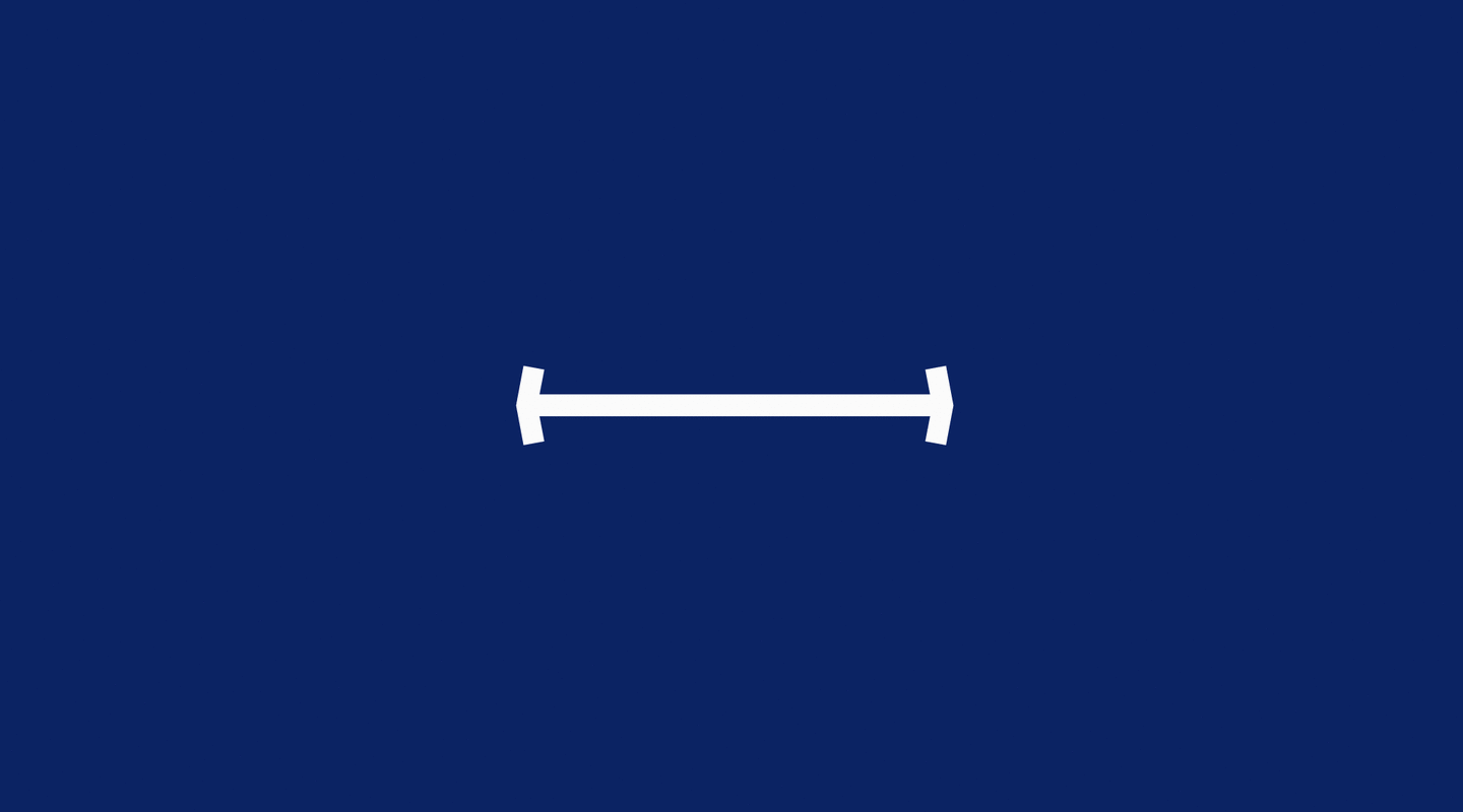
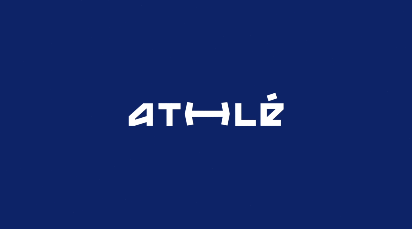
The new name drives the transformation: its shortened form rolls off the tongue, conveying the full force of its disciplines and evidence of its deep roots in our society. The logo reconnects the brand to reality. It evokes the authentic core of athletics: being every sport for everyone. By “cutting” into the typography to make it more angular, we have highlighted its history, power, and the universal nature of the world’s first sports.
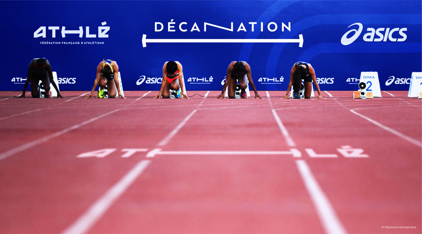
A brand with two faces
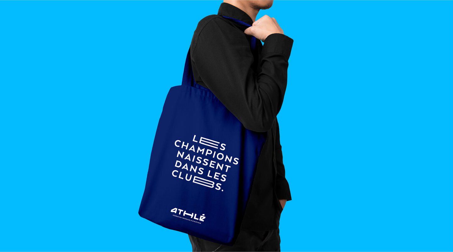
The brand can now carry the strength of the organisation through its official communications, but also have a more casual conversation with the public by presenting the everyday, accessible side of the federation.
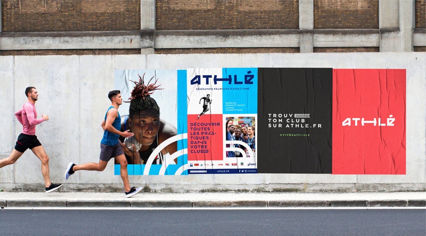
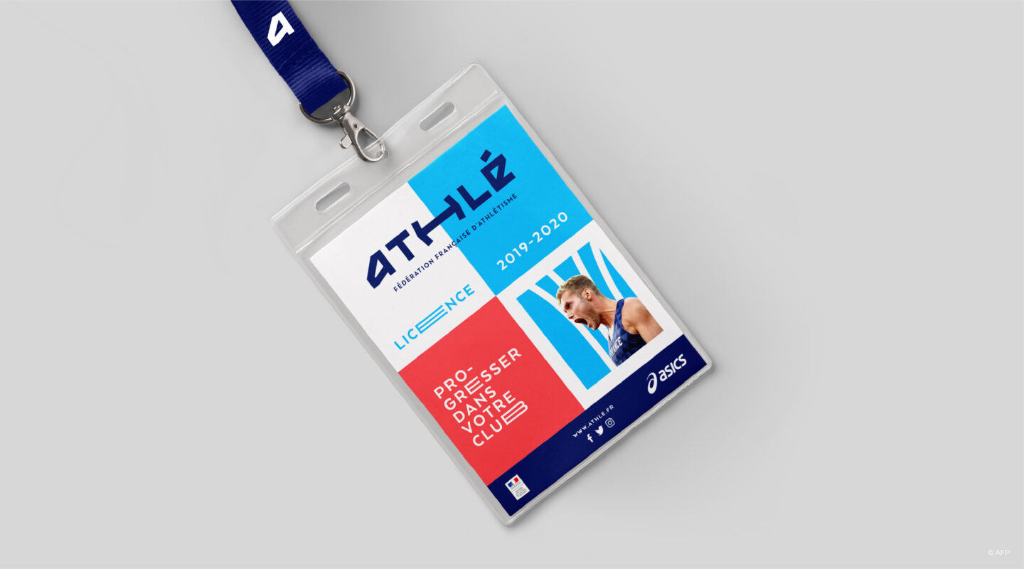
An agile system
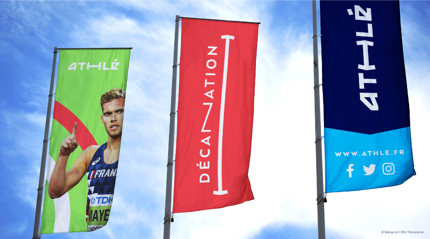
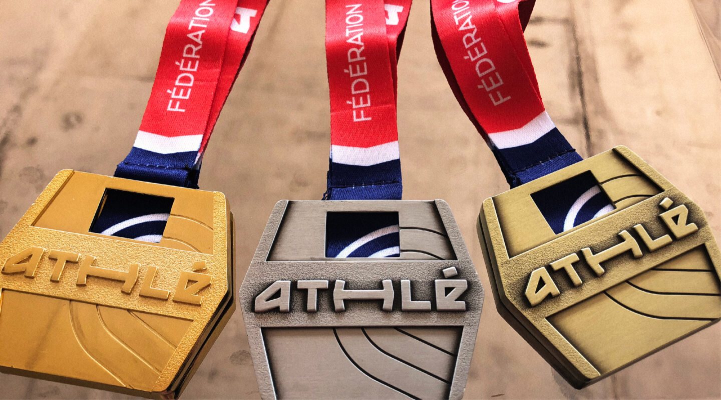
The accompanying territory offers richness and modularity of application, allowing it to be easily adapted to the various forms of communication media (events, recruitment, etc.) and stakeholders (members, clubs, sponsors, partners, etc.).
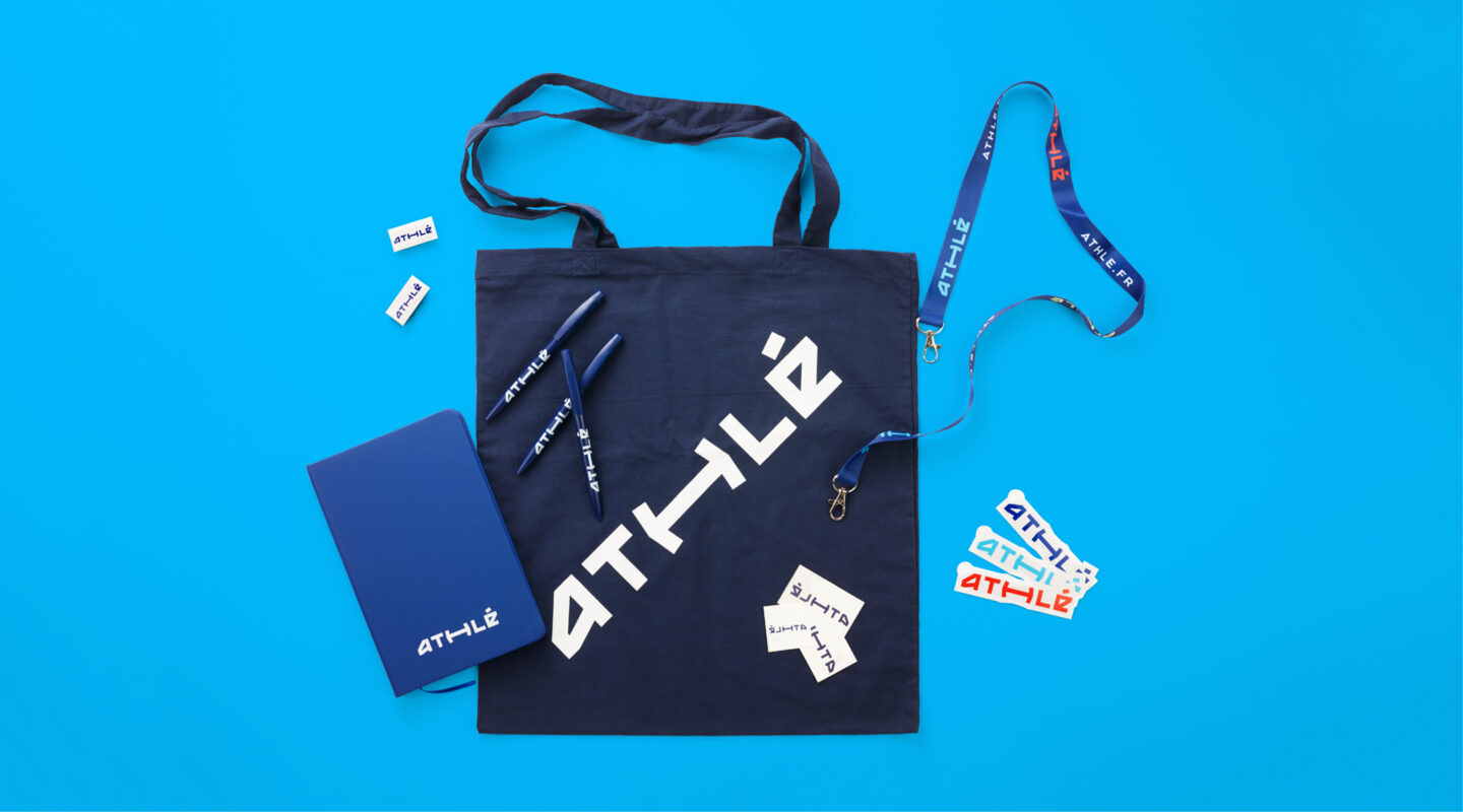
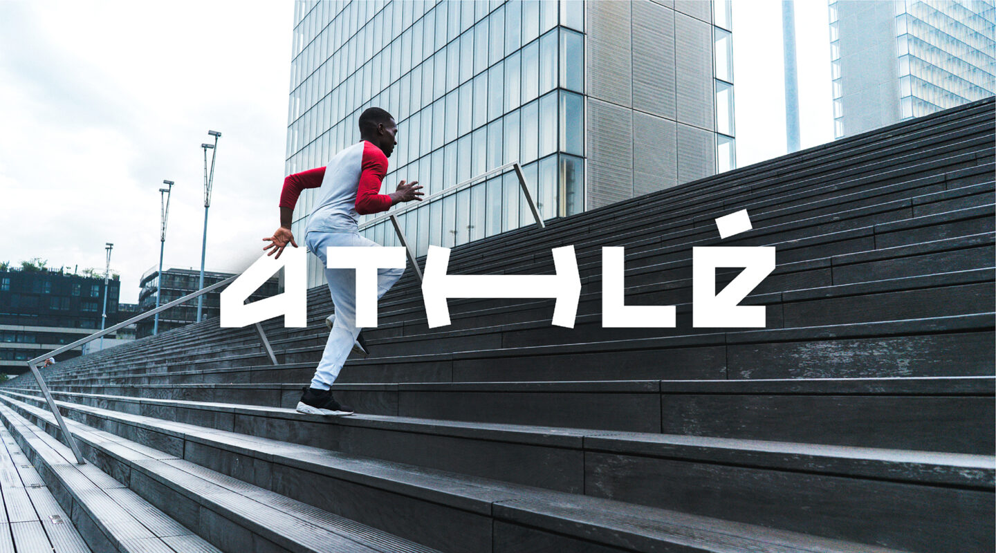
A lively territory
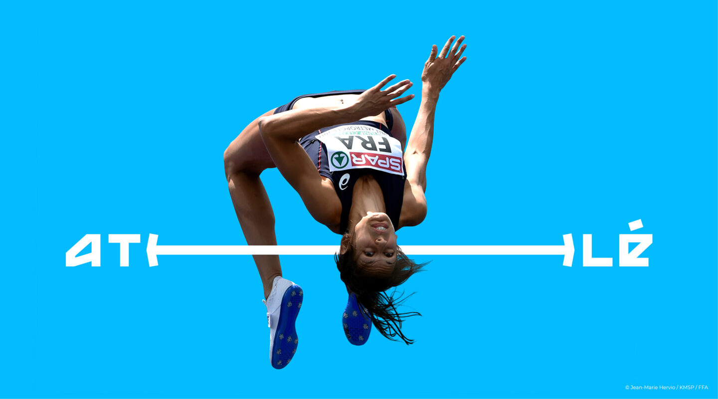
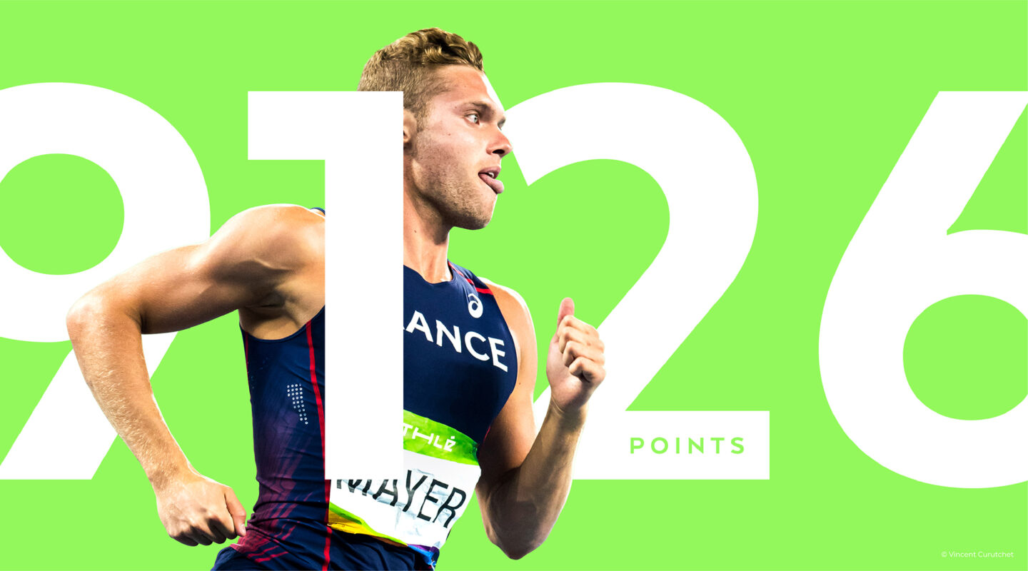
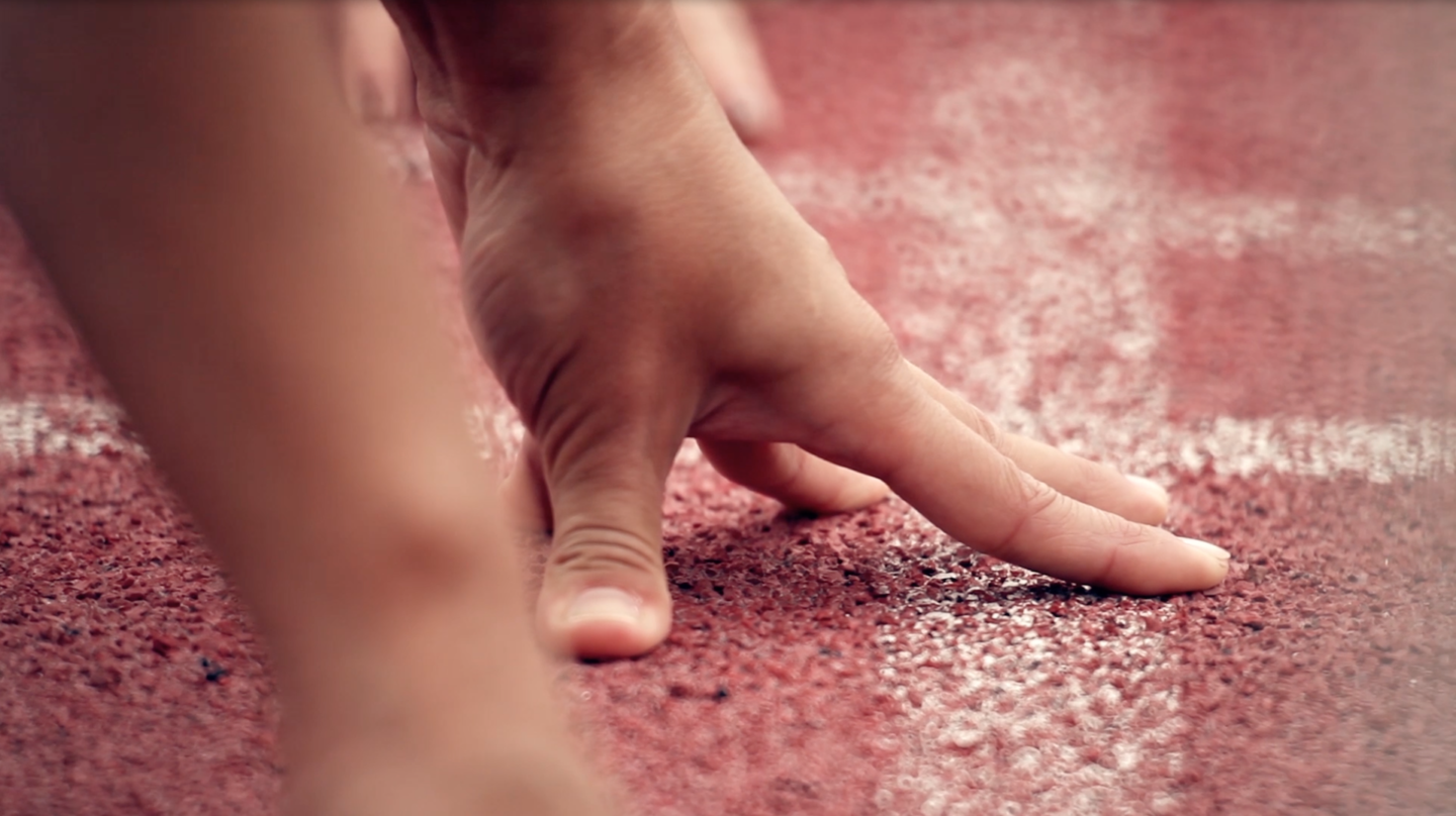
A stretching typography to represent the physical efforts, vibrant and attractive colours, forms inspired by the sporting environment and emotions, a “cut-out” iconography highlighting the spectacle and energy of athletic movement…. Athlé now has all the key ingredients to enhance its brand content.