AYVENS
AN ALLIANCE THAT MAKES SENSE
Bringing together their complementary expertise, aware of the climate crisis and the need to act quickly, ALD Automotive and LeasePlan have joined forces with a common ambition: to improve mobility by offering new solutions and experiences.
We helped them define their brand strategy, positioning, new name and visual and verbal identity.
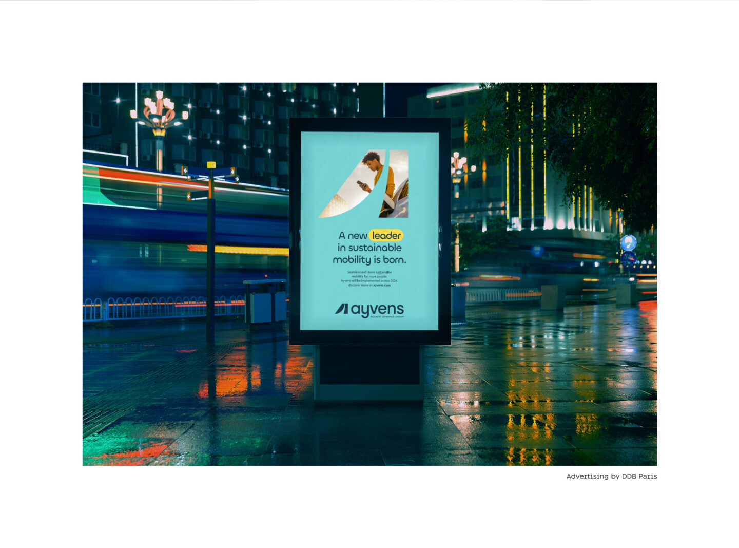
BRINGING TO LIFE THE NEW WORLD LEADER IN SUSTAINABLE MOBILITY
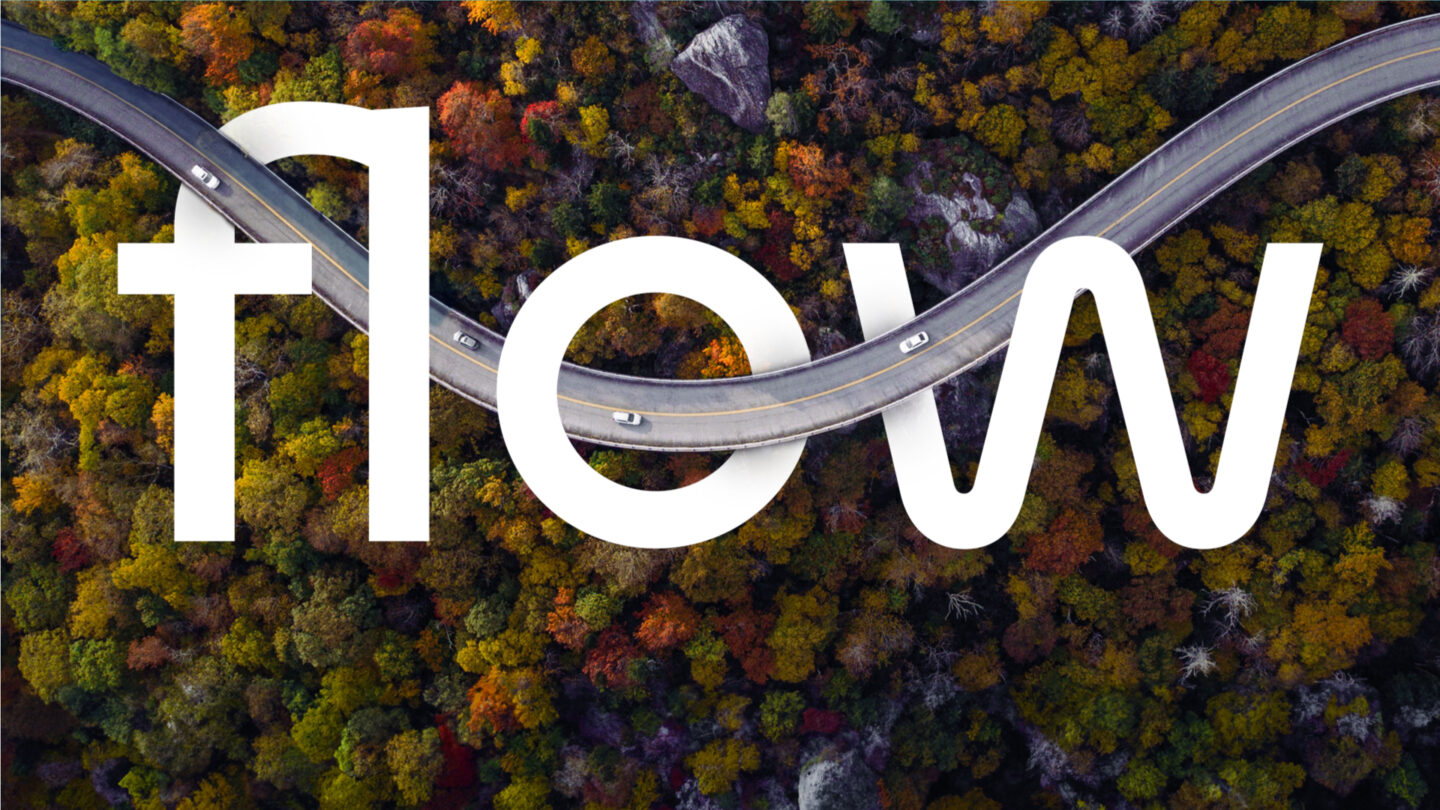
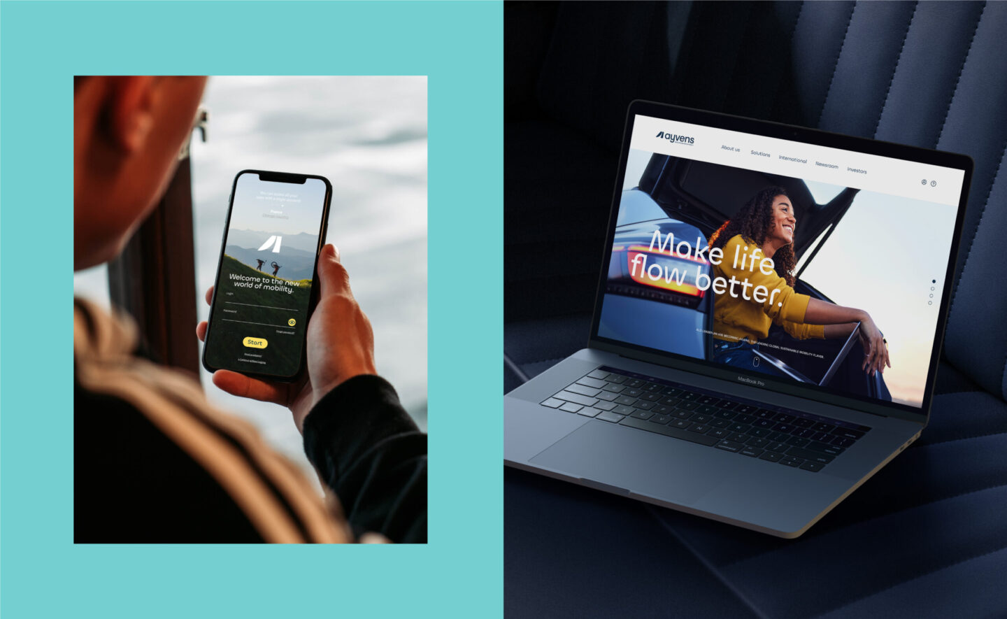
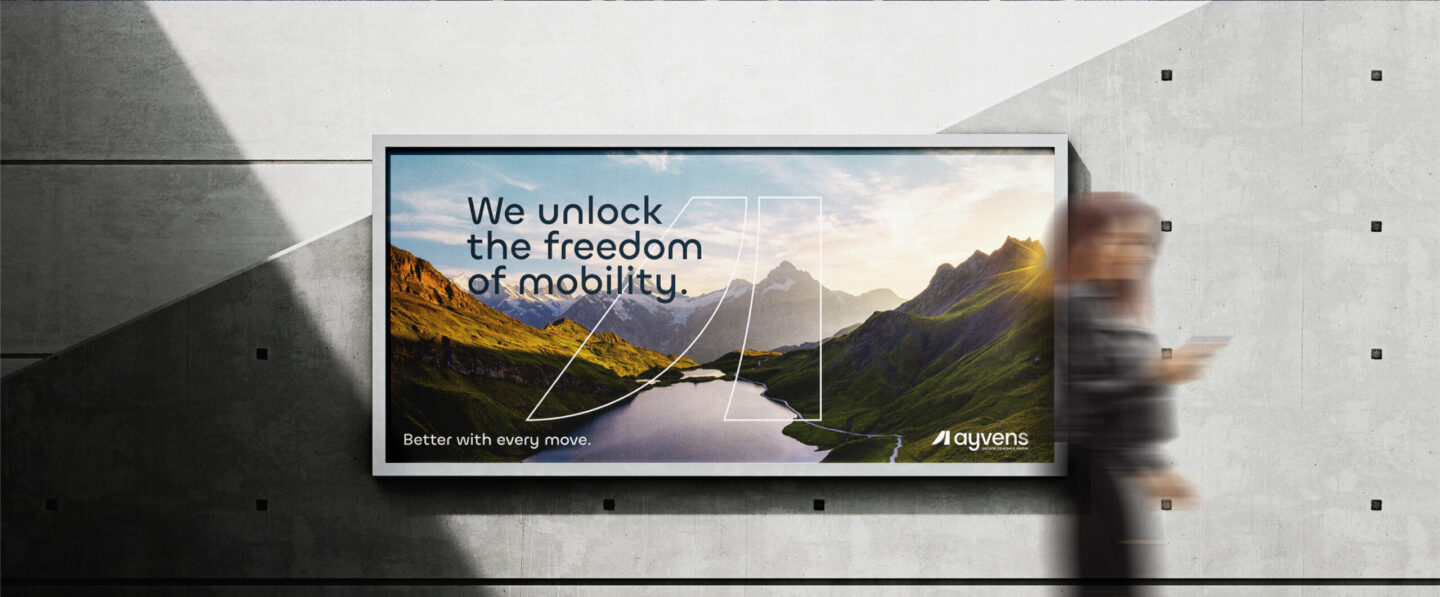
To translate its vision and DNA and position this player as unique on the market, we are promoting a simple, universal promise: „Make life flow better”, to make users’ lives smoother, thanks to better thought-out, more harmonious and, of course, more sustainable mobility. Intelligent mobility that appeals to as many people as possible, is infinitely adaptable and can be deployed everywhere.
With „Ayvens”, mobility is not a question of destination, but of experience.
Play

A NEW NAME FOR LEADERSHIP AND MOVEMENT
Dragon Rouge collaborated with naming agency Namibia to create a new name rich in meaning: „Ayvens”.
It finds its foundations in three Anglo-Saxon words, evocative of progress, evolution and optimism. „Way” means the way, „Advance” the action of moving forward and „Heaven” paradise. Its soft, rhythmic sound expresses the confidence of a leader, a constant drive for innovation and a wealth of mobility offers.
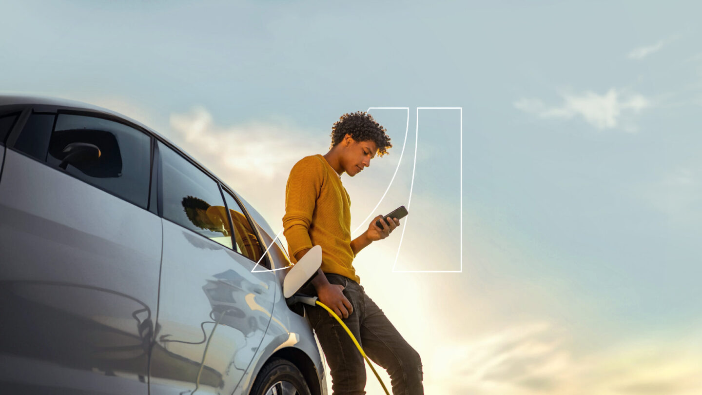
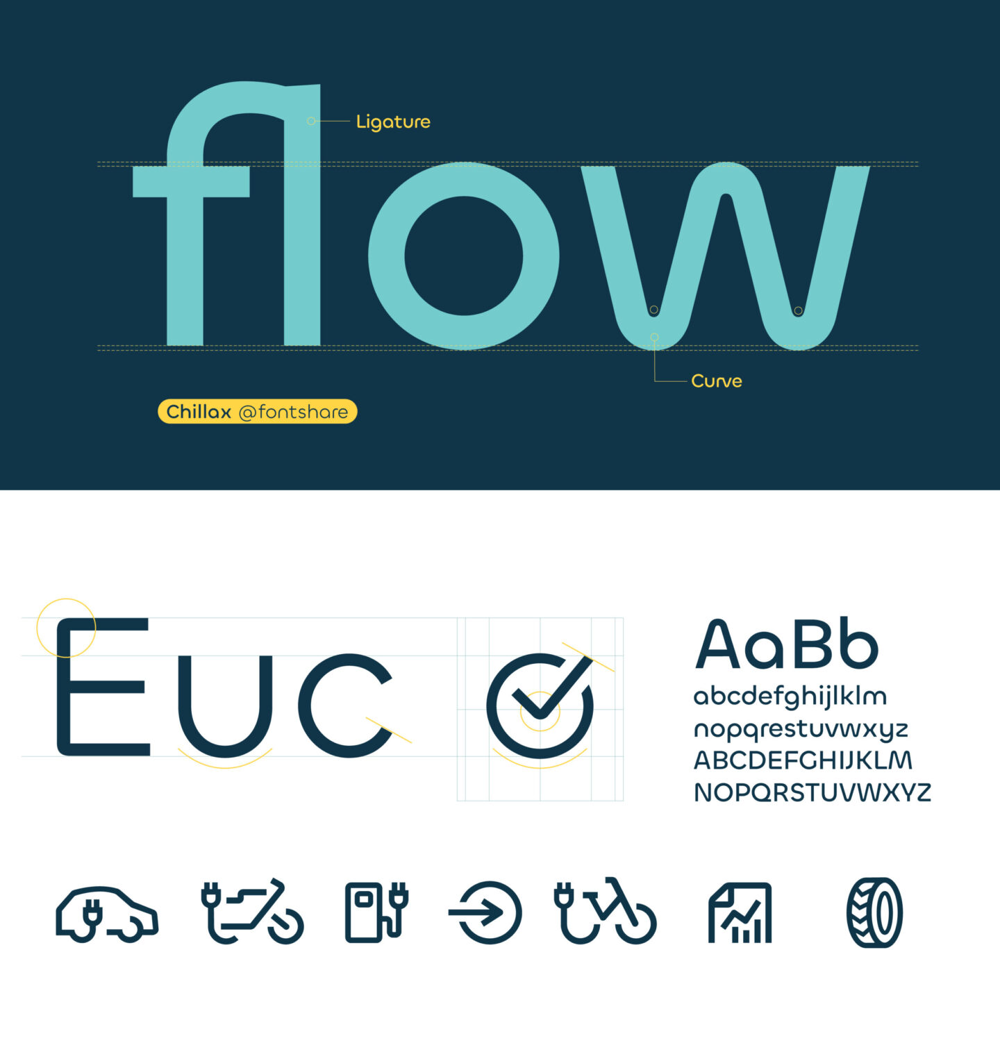
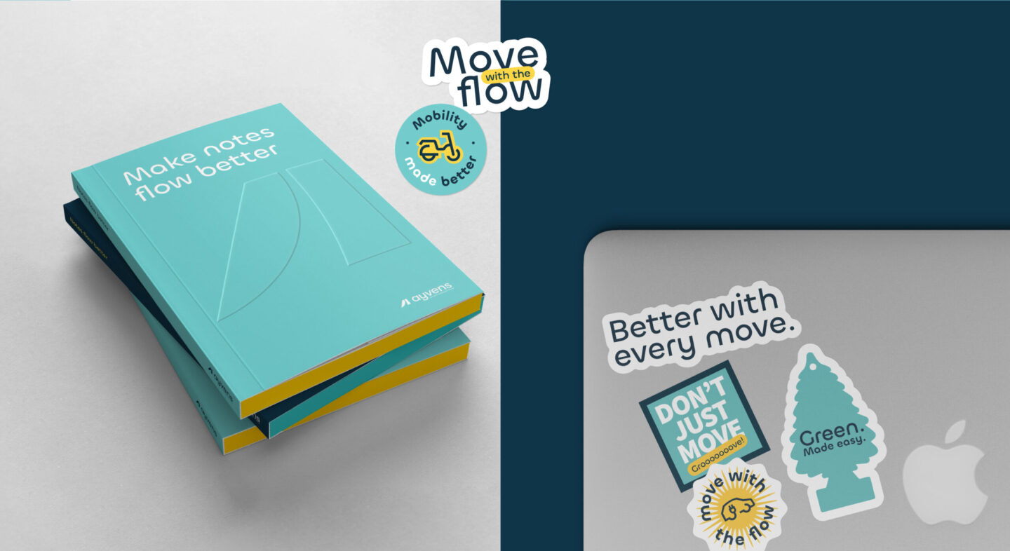
AN IDENTITY FULL OF ENERGY AND MOVEMENT
The graphic universe expresses the very essence of this brand.
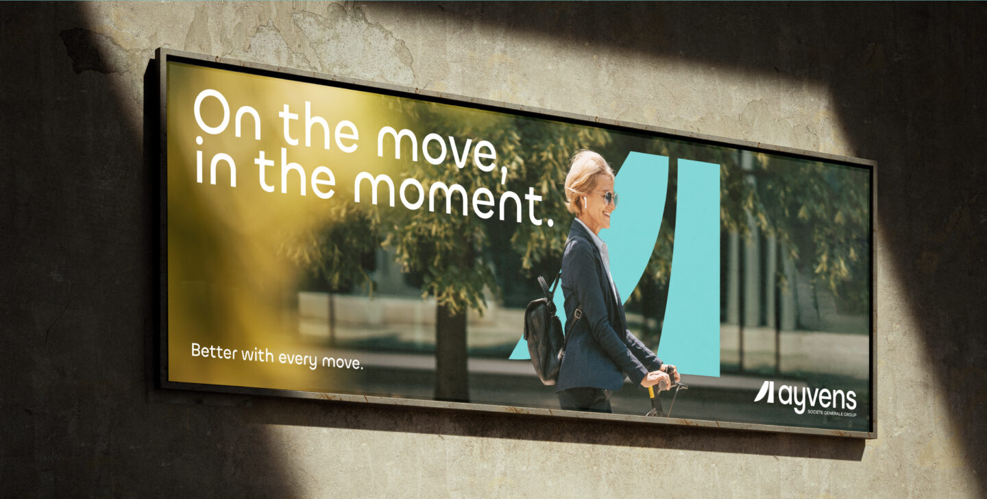
The charter expresses energy and dynamism through an iconography full of life, embodying every moment, every journey.
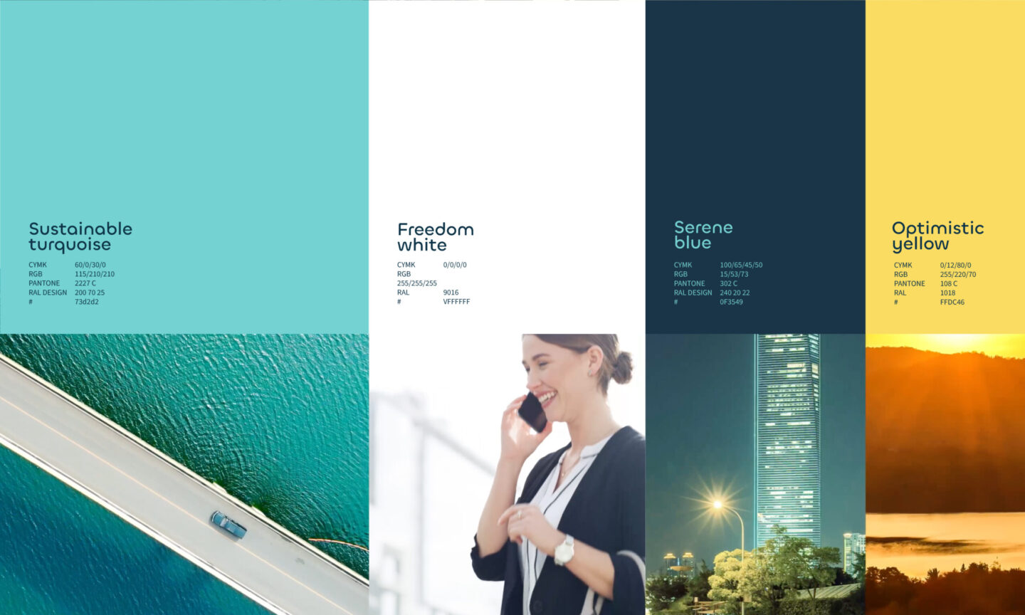
Designed to stand out, the colors highlight the brand’s personality: turquoise evokes sustainable development, blue illustrates serenity, white embodies freedom and yellow invites optimism.
THAT COMES TO LIFE IN PEOPLE'S DAILY LIVES
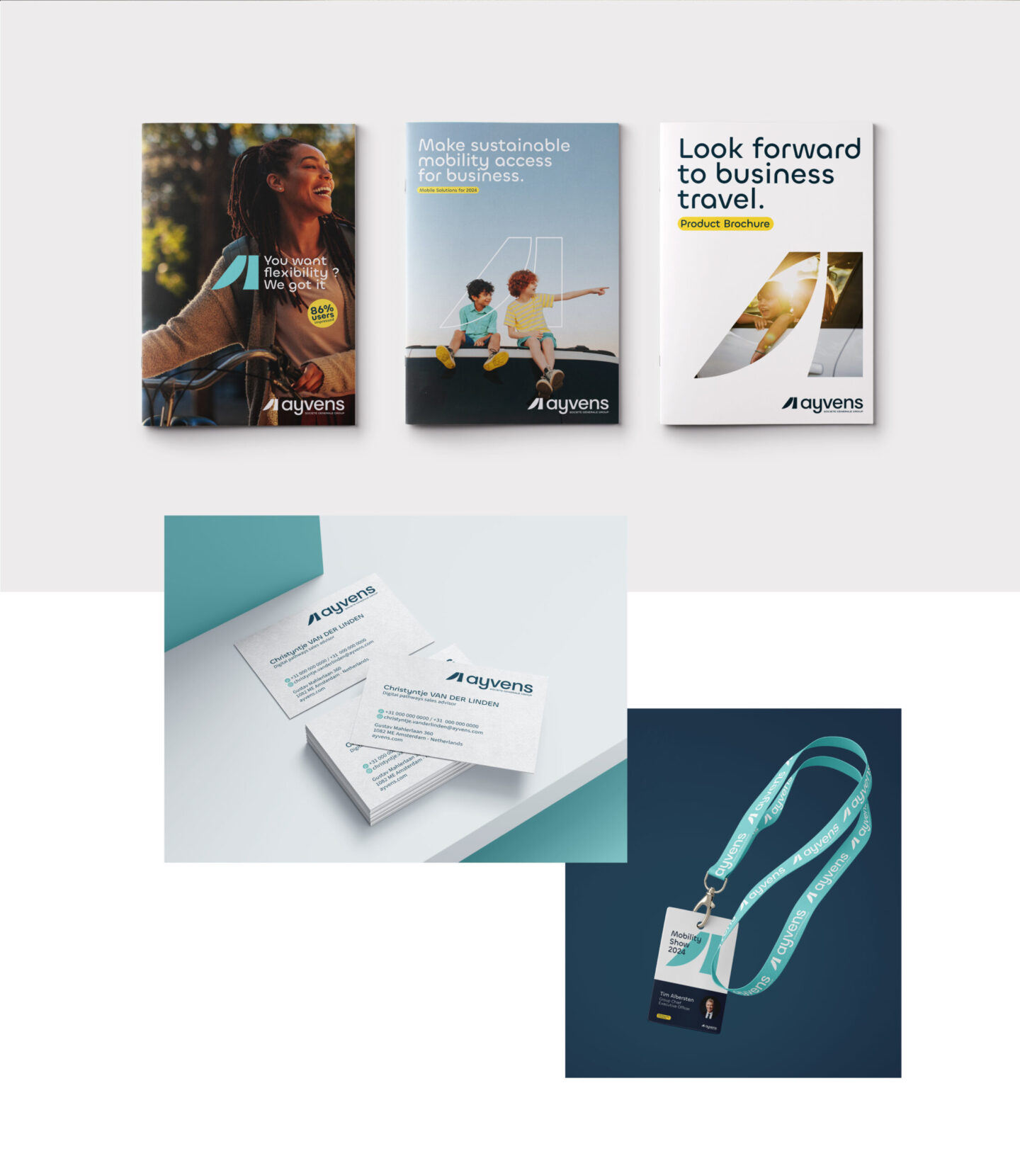
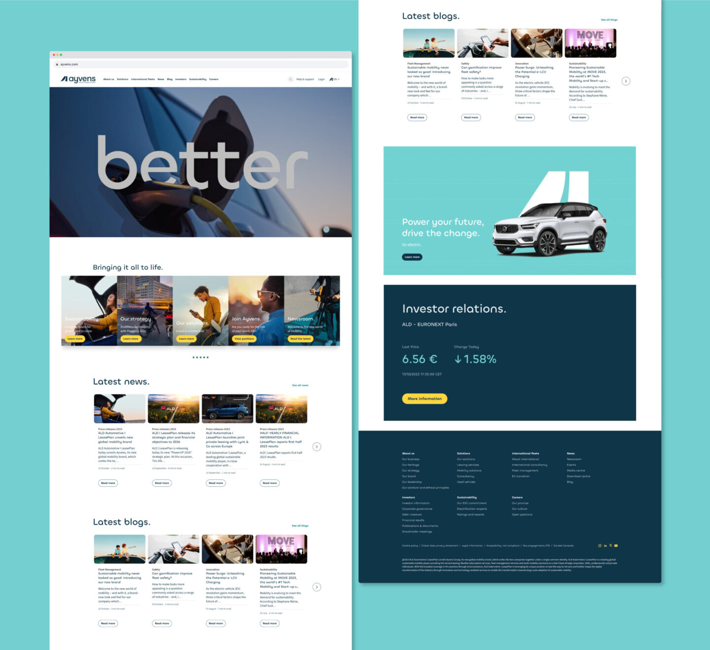
The new brand will be deployed immediately in the 44 countries where Ayvens is present. It will be used for all customer segments (businesses, SMEs, professionals and individuals) and at all their points of contact, with a strong focus on the brand's digital expression.

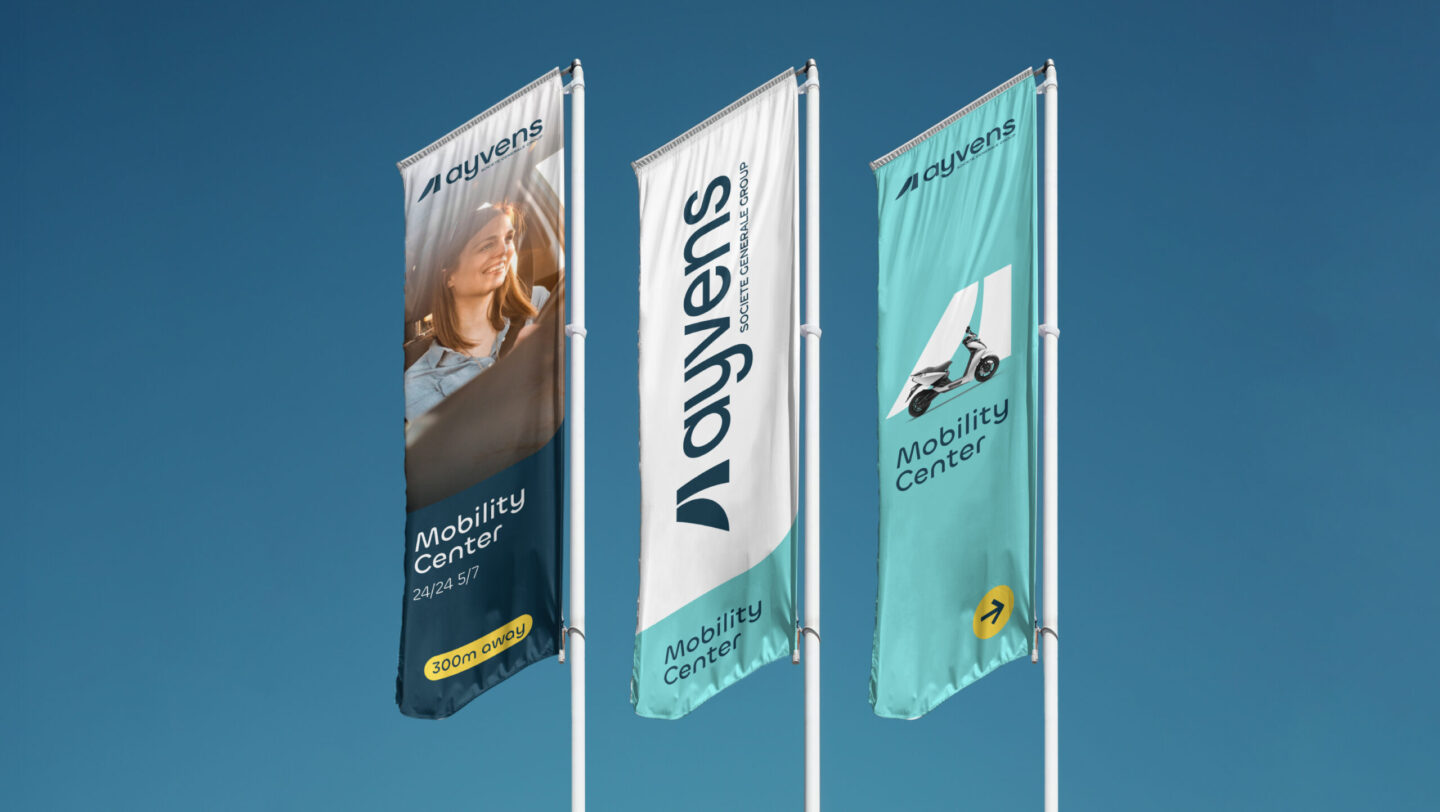
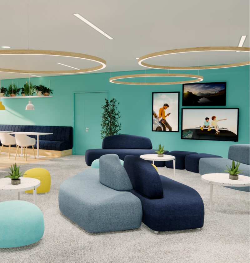
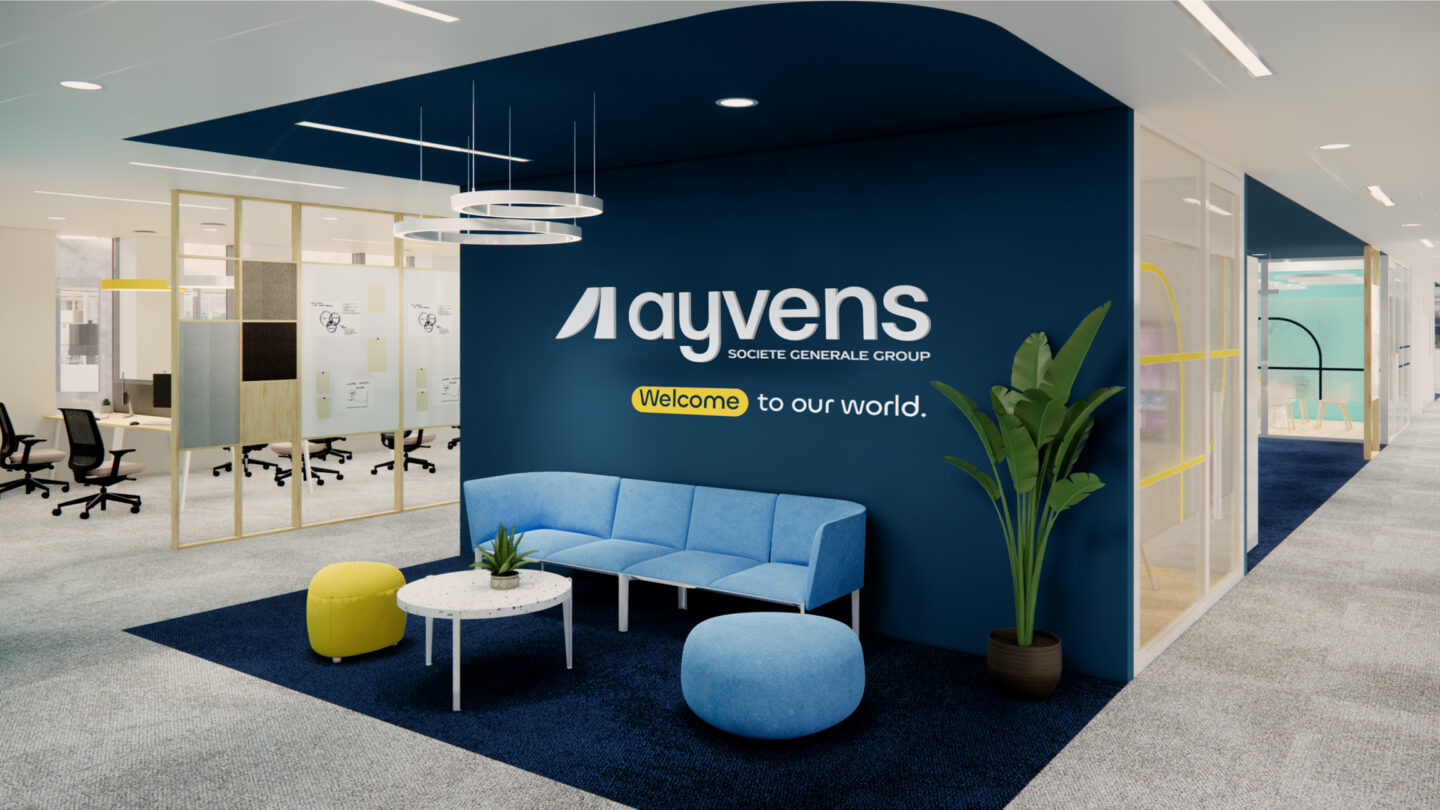
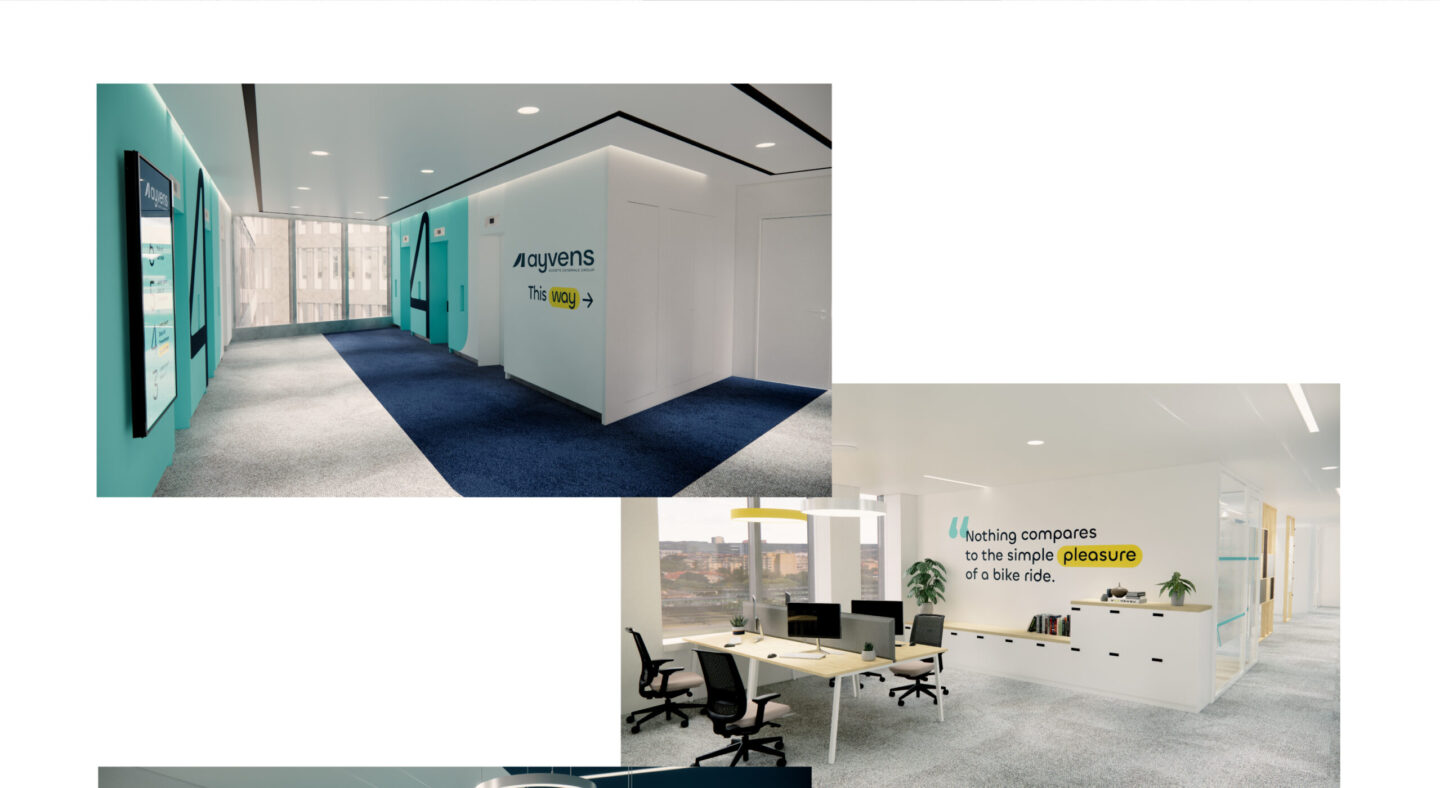
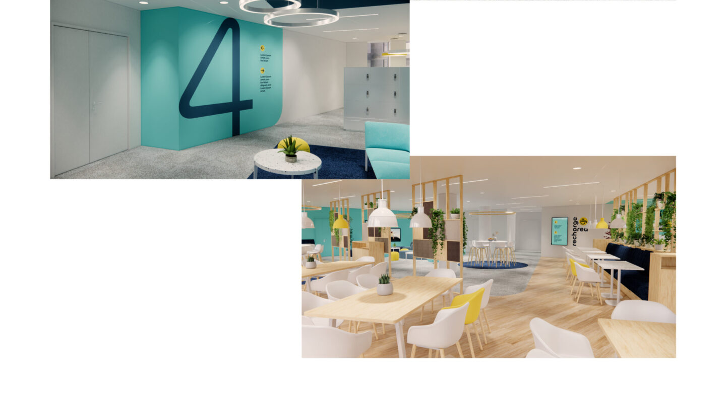
REINVENTING PLACES TO BRING PEOPLE TOGETHER
From French and Dutch head offices to Mobility centers, the brand's expression comes to life on site, deploying the brand's key assets.

It's a complex exercise to create a name and a sign that bring together a brand of this magnitude. The team worked hard to create a simple yet polysemous graphic vocabulary. Behind every sign, every shape and every color is the idea of "flow" and progress in mobility.